Панель инструментов Nautilus и строка состояния
Я решил проблему, установив пакеты libc6-armel, libsfgcc1 и libsfstdc++6, как описано здесь: https://bugs.launchpad.net/linaro-ubuntu/+bug/1095415
18 ответов
Я изменил тему атмосферы на темные панели инструментов (включая nautilus, banshee и т. д.) и некоторые другие изменения в виде небольших полос прокрутки. Мои изменения основаны на теме Wasp (см. Gnome-look).
Это выглядит так:
Здесь вы можете найти целую тему: тема атмосферы с темной панелью инструментов [!d3 ]
Значки - это персональное сочетание AwOken и Faenza. Я могу опубликовать его, если вы заинтересованы.
Мое измененное gtkrc для атмосферы:
gtk-color-scheme = "base_color:#ffffff\nfg_color:#4c4c4c\ntooltip_fg_color:#ffffff\nselected_bg_color:#7EA2B8\nselected_fg_color:#FFFFFF\ntext_color:#3C3C3C\nbg_color:#F2F1F0\ntooltip_bg_color:#000000\nlink_color:#7EA2B8"

gtk-icon-sizes = "panel-menu=22,22:gtk-button=16,16"

gtk-auto-mnemonics = 1

style "default" {
    xthickness = 1
    ythickness = 1

    #######################
    # Style Properties
    #######################
    GtkWidget::new-tooltip-style = 1
    GtkButton::child-displacement-x = 1
    GtkButton::child-displacement-y = 1
    GtkButton::default-border = { 0, 0, 0, 0 }

    GtkCheckButton::indicator-size = 16

    GtkPaned::handle-size = 0  #MSE

    GtkRange::trough-border = 0
    GtkRange::slider-width = 14
    GtkRange::stepper-size = 16
    GtkRange::trough-under-steppers = 1

    GtkScale::trough-border = 0
    GtkScale::slider-width = 23
    GtkScale::slider-length = 14
    GtkScale::trough-side-details = 1

    GtkScrollbar::activate-slider = 1
    GtkScrollbar::trough-border = 0
    GtkScrollbar::stepper-size = 0
    GtkScrollbar::slider-width = 7
    GtkScrollbar::min-slider-length = 31
    GtkScrollbar::has-backward-stepper  = 0
    GtkScrollbar::has-forward-stepper   = 0

    GtkScrolledWindow::scrollbar-spacing = 2
    GtkScrolledWindow::scrollbars-within-bevel = 1

    GtkMenuBar::internal-padding = 0
    GtkExpander::expander-size = 11
    GtkToolbar::internal-padding = 1
    GtkToolbar::shadow-type = GTK_SHADOW_NONE
#   GtkTreeView::expander-size = 7
#   GtkTreeView::vertical-separator = 0
#   GtkTreeView::odd-row-color = shade (0.96, @base_color) # MSE
    GtkNotebook::tab-overlap = -1

    GtkMenu::horizontal-padding = 0
    GtkMenu::vertical-padding = 0

    WnckTasklist::fade-overlay-rect = 0
    # The following line hints to gecko (and possibly other appliations)
    # that the entry should be drawn transparently on the canvas.
    # Without this, gecko will fill in the background of the entry.
    GtkEntry::honors-transparent-bg-hint = 1
    GtkEntry::state-hint = 0
    GtkEntry::progress-border = { 2, 2, 2, 2 }

    GtkProgressBar::min-horizontal-bar-height = 14
    GtkProgressBar::min-vertical-bar-width = 14

    GtkImage::x-ayatana-indicator-dynamic = 1
    GtkMenuBar::window-dragging = 1

    GtkWidget::link-color = @link_color
    GtkWidget::visited-link-color = @text_color

    ####################
    # Color Definitions
    ####################
    bg[NORMAL]        = @bg_color
    bg[PRELIGHT]      = shade (1.02, @bg_color)
    bg[SELECTED]      = @selected_bg_color
    bg[INSENSITIVE]   = shade (0.95, @bg_color)
    bg[ACTIVE]        = shade (0.9, @bg_color)

    fg[NORMAL]        = @fg_color
    fg[PRELIGHT]      = @fg_color
    fg[SELECTED]      = @selected_fg_color
    fg[INSENSITIVE]   = darker (@bg_color)
    fg[ACTIVE]        = @fg_color

    text[NORMAL]      = @text_color
    text[PRELIGHT]    = @text_color
    text[SELECTED]    = @selected_fg_color
    text[INSENSITIVE] = shade (0.8, @bg_color)
    text[ACTIVE]      = darker (@text_color)

    base[NORMAL]      = @base_color
    base[PRELIGHT]    = shade (0.98, @bg_color)
    base[SELECTED]    = @selected_bg_color
    base[INSENSITIVE] = shade (0.97, @bg_color)
    base[ACTIVE]      = shade (0.94, @bg_color)

    engine "murrine" {
        contrast = 0.6
        arrowstyle = 2
        reliefstyle = 3
        highlight_shade = 1.0
        glazestyle = 0
        default_button_color = shade (1.1, @selected_bg_color)
        gradient_shades = {1.1, 1.0, 1.0, 0.9}
        roundness = 4
        lightborder_shade = 1.26
        lightborderstyle = 1
        listviewstyle = 2
        progressbarstyle = 0
        colorize_scrollbar = TRUE #FALSE #MSE
        menubaritemstyle = 1
        menubarstyle = 1
        menustyle = 2
        focusstyle = 3
        handlestyle = 1
        sliderstyle = 3
        scrollbarstyle = 0 #2
        stepperstyle = 3
#       rgba = TRUE
    }
}

style "dark"
{
    fg[NORMAL]        = "#dfdbd2"
    fg[PRELIGHT]      = "#fff"
    fg[ACTIVE]        = "#fff"
    fg[SELECTED]      = "#fff"
    fg[INSENSITIVE]   = shade (0.5, "#3c3b37")

    bg[NORMAL]        = "#3c3b37"
    bg[PRELIGHT]      = shade (1.0, "#4D4C48")
    bg[ACTIVE]        = shade(0.94, "#3c3b37")
    bg[SELECTED]      = shade(1.0, @selected_bg_color)
    bg[INSENSITIVE]   = "#3c3b37"

    base[NORMAL]      = "#3c3b37" #"#333230"
    base[PRELIGHT]    = shade (0.95, @bg_color)
    base[ACTIVE]      = shade (0.55, @bg_color)
    base[SELECTED]    = shade (1.0, @selected_bg_color)
    base[INSENSITIVE] = @bg_color

    text[NORMAL]      = "#dfdbd2"
    text[PRELIGHT]    = @base_color
    text[ACTIVE]      = @base_color
    text[SELECTED]    = @base_color
    text[INSENSITIVE] = mix (0.5, @bg_color, "#3c3b37")
}

style "narrow" {
    xthickness = 1
    ythickness = 1
}

style "wide" {
    xthickness = 2
    ythickness = 2
}

style "wider" {
    xthickness = 3
    ythickness = 3
}

style "entry" {
    xthickness = 3
    ythickness = 3

    engine "murrine" {
    }
}

style "vscale" {
}

style "hscale" {
}

style "button" = "wider"
{
    bg[NORMAL]   = shade (1.10, @bg_color)
    bg[PRELIGHT] = mix(0.82,shade (1.1, @bg_color),@selected_bg_color)
    bg[ACTIVE]   = shade (0.85, @bg_color)

    engine "murrine"
    {
        border_shades       = { .8, .5} # draw a gradient on the border.
        #border_colors       = { "#D9D4CC", "#D9D4CC" }
        border_colors       = { @bg_color, @bg_color}
        contrast = 1.4
        lightborder_shade = 1.06
    }
}
style "notebook_button" {

    xthickness = 3
    ythickness = 3

    bg[NORMAL] = @bg_color
    bg[PRELIGHT] = shade (1.04, @bg_color)
    bg[ACTIVE] = shade (0.96, @bg_color)
    bg[INSENSITIVE] = @bg_color

    engine "murrine" {
        textstyle = 1
        border_shades = {0.95, 0.88}
        glowstyle = 5
        glow_shade = 1.02
        lightborder_shade = 1.32
    }
}

style "spinbutton" = "notebook_button" {
    xthickness = 4

    engine "murrine" {
    }
}

style "scrollbar" = "button" {  #"button"
    xthickness = 2
    ythickness = 2

    bg[NORMAL] = "#3c3b37"
    bg[PRELIGHT] = shade (1.10, "#3c3b37")
        bg[ACTIVE] = shade (1.10, "#3c3b37")

    engine "murrine"
    {
        border_shades = {0.95, 0.90}
        roundness = 20
        contrast = 1.0
        trough_shades = {0.92, 0.98}
        lightborder_shade = 1.3
        glowstyle = 5
        glow_shade = 1.02
        gradient_shades = {1.2, 1.0, 1.0, 0.86}
        trough_border_shades = {0.9, 0.98}
    }
}

style "hscrollbar" {
}

style "vscrollbar" {
}

style "scale" = "button" {
    bg[NORMAL] = @bg_color
    bg[PRELIGHT] = shade (1.06, @bg_color)
    bg[ACTIVE] = shade (0.94, @bg_color)

    engine "murrine" {
        contrast = 0.6
        border_shades = {0.9, 0.8}
        roundness = 5
        lightborder_shade = 1.32
        gradient_shades = {1.1, 1.0, 1.0, 0.8}
        handlestyle = 2
        trough_border_shades = {0.9, 1.4}
        glow_shade = 1.0
#       reliefstyle = 2
#       shadow_shades = { 1.0, 0.9 }
    }
}

style "notebook_bg" {
    bg[NORMAL] = shade (1.02, @bg_color)
    bg[ACTIVE] = shade (0.97, @bg_color)
    fg[ACTIVE] = mix (0.8, @fg_color, shade (0.97, @bg_color))
}

# The color is changed by the notebook_bg style, this style
# changes the x/ythickness
style "notebook" {
    xthickness = 2
    ythickness = 2

    engine "murrine" {
        roundness = 3
        contrast = 0.8
        focusstyle = 2
        lightborder_shade = 1.16
        gradient_shades = {1.1, 1.0, 1.0, 0.68}
    }
}

style "statusbar" {
    engine "murrine" {
        contrast = 1.2
    }
}

style "comboboxentry" = "notebook_button" {
    xthickness = 3
    ythickness = 3

    engine "murrine" {
        textstyle = 1
        glowstyle = 5
        glow_shade = 1.02
    }
}

style "menubar" = "dark" {
    engine "murrine" {
        textstyle = 2
        text_shade = 0.33
        gradient_shades = {1.0, 1.0, 1.0, 1.0}
        lightborder_shade = 1.23
    }
}
style "dark-toolbar" = "dark"
{
    xthickness = 3
    ythickness = 3
    bg[NORMAL] = "#3c3b37" #"#343330"
    bg[PRELIGHT] =  shade (0.65, @selected_bg_color)
    bg[SELECTED] =  shade (0.35, @bg_color)
    bg[ACTIVE] =  shade (0.35, @bg_color)

    engine "murrine"
    {
        border_shades = {1.3, 1.1} # draw a gradient on the border.
        border_colors = {"#3c3b37", "#3c3b37"}#{ "#343330", "#343330" }
        glowstyle = 4
        gradient_shades = {1.05,1.0,1.0,0.9}
            highlight_shade = 1.1
            lightborder_shade   = 1.05
            reliefstyle = 4     # 0 = flat, 1 = inset, 2 = shadow, = 3 for a gradient on shadow, = 4 for a stronger shadow.
            contrast = 1.4
    }
}

style "dark-toolbar-sep" = "dark-toolbar"
 { xthickness = 2 }


style "pixmap-dark-toolbar" = "dark-toolbar"
{
    xthickness = 1
    ythickness = 1
    # To-do: make the toolbar recolorable, possibly without using pixmaps
    # We only like this because of the top line, anyway.
    engine "pixmap"{
        image {
            function = BOX
            file = "toolbar_o.png"
            border = {1,1,1,1}
        }
        image
        {
              function              = HANDLE
              overlay_file          = "handlebox.png"
              overlay_stretch   = FALSE
              orientation           = HORIZONTAL
            }
            image
        {
              function              = HANDLE
              overlay_file          = "handlebox.png"
              overlay_stretch   = FALSE
              orientation           = VERTICAL
            }
            image
        {
               function        = VLINE
               recolorable        = TRUE
               file                = "blank.png"
        }
        image
        {
              function            = HLINE
              recolorable        = TRUE
              file                = "blank.png"
        }
    }
}


style "toolbar-button" = "notebook-button" {
    engine "murrine" {
    }
}

style "menu" = "dark" {
    xthickness = 0
    ythickness = 0

    bg[NORMAL] = "#43423f"
    bg[INSENSITIVE] = "#43423f"
    fg[INSENSITIVE]   = shade (0.54, "#43423f")

    engine "murrine"
    {
        roundness = 0
    }
}

style "menu_item" = "menu" {
    xthickness = 2
    ythickness = 3

    fg[PRELIGHT] = @selected_fg_color

    engine "murrine"
    {
        glowstyle = 5
        glow_shade = 1.1
        border_shades = {0.95, 0.85}
    }
}

style "menubar_item" = "menu" {
    xthickness = 2
    ythickness = 3

    engine "murrine" {
        gradient_shades = {1.1, 1.0, 1.0, 0.88}
        glowstyle = 5
        glow_shade = 1.0
        border_shades = {1.0, 0.9}
        lightborderstyle = 3
        lightborder_shade = 1.26
    }
}

style "scale_menu_item" = "scale" {
    GtkScale::slider-width = 21
    GtkScale::slider-length = 13

    bg[ACTIVE] = shade(0.98, "#4D4C48")
    bg[INSENSITIVE] = shade (0.9, @bg_color)

    engine "murrine" {
        roundness = 20
        border_shades = {1.4, 1.4}
        reliefstyle = 0
        lightborder_shade = 1.36
    }
}

# This style is there to modify the separator menu items. The goals are:
# 1. Get a specific height.
# 2. The line should go to the edges (ie. no border at the left/right)
style "separator_menu_item" {
    xthickness = 1
    ythickness = 0

    GtkSeparatorMenuItem::horizontal-padding = 0
    GtkWidget::wide-separators = 1
    GtkWidget::separator-width = 1
    GtkWidget::separator-height = 7

    engine "murrine" {
        contrast = 0.6
        separatorstyle = 0
    }
}

style "separator_tool_item" {
    xthickness = 0
    ythickness = 1

    GtkVSeparator::vertical-padding = 0
    GtkWidget::wide-separators = 1
    GtkWidget::separator-width = 7
    GtkWidget::separator-height = 1

    engine "murrine" {
        contrast = 0.6
        separatorstyle = 0
    }
}

style "frame_title" {
    fg[NORMAL] = lighter (@fg_color)
}

style "treeview" {
    engine "murrine"
    {
        roundness = 2
        lightborder_shade = 1.1
        gradient_shades = {1.04, 1.0, 1.0, 0.96}
    }
}

style "progressbar" {
    xthickness = 1
    ythickness = 1

    bg[ACTIVE] = shade (0.94, @bg_color)
    fg[PRELIGHT] = @selected_fg_color
    #bg[SELECTED] = "#cdcdcd"

    engine "murrine" {
        #trough_shades = {0.98, 1.02}
        roundness = 8
        lightborderstyle = 1
        lightborder_shade = 1.26
        border_shades = {0.95, 0.85}
        gradient_shades = {1.1, 1.0, 1.0, 0.9}
        trough_border_shades = {0.9, 1.4}
    }
}

style "progressbar_menu_item" = "progressbar" {
    bg[ACTIVE] = shade(0.98, "#4D4C48")

    engine "murrine" {
        roundness = 0
    }
}

# This style is based on the default style, so that the colors from the button
# style are overriden again.
style "treeview_header" = "notebook_button" {
    xthickness = 2
    ythickness = 1

    engine "murrine" {
        glazestyle = 1
        contrast = 0.8
        lightborder_shade = 1.16
        textstyle = 1
        glow_shade = 1.0
    }
}

style "treeview_header_scrolled" = "treeview_header" {
}

style "scrolledwindow" {
    engine "murrine" {
        contrast = 0.6
    }
}

style "radiocheck"  = "button" {
    text[NORMAL] = shade (0.535, @selected_bg_color)
    text[PRELIGHT] = shade(1.06, shade (0.535, @selected_bg_color))
    bg[NORMAL]   = shade (0.92, @bg_color)
    bg[PRELIGHT] = mix (0.2, @selected_bg_color, shade(1.1, @bg_color))
    fg[INSENSITIVE] = darker (@bg_color)
    fg[ACTIVE] = @fg_color

    engine "murrine" {
        reliefstyle = 3
        gradient_shades = {1.2, 1.0, 1.0, 0.9}
        shadow_shades = {0.6, 0.5}
        textstyle = 0
    }
}

style "tooltips" {
    xthickness = 4
    ythickness = 4

    bg[NORMAL]        = @tooltip_bg_color
    fg[NORMAL]        = @tooltip_fg_color
    bg[SELECTED]      = "#000000"

    engine "murrine" {
        rgba = TRUE
    }
}

style "infobar" {
    engine "murrine" {
    }
}

style "nautilus_location" {
    bg[NORMAL]  = mix (0.60, shade (1.05, @bg_color), @selected_bg_color)

}

style "nautilus-sidepane" {
    GtkTreeView::expander-size = 7
    GtkTreeView::vertical-separator = 0
    GtkWidget::separator-height = 0
        GtkTreeView::horizontal-separator = 0 # add extra the padding
    GtkTreeView::odd-row-color = @base_color
    GtkTreeView::even-row-color = @bg_color #"#CBD9E2"
}

style "calendar" {
    xthickness = 0
    ythickness = 0

    engine "murrine" {
        roundness = 0
    }
}

style "calendar_menu_item" = "calendar" {
    base[NORMAL] = "#605E58"
    base[ACTIVE] = "#4b4944"
}

style "iconview" {
    engine "murrine" {
        roundness = 6
        border_shades = {1.16, 1.0}
        glow_shade = 1.1
        glowstyle = 5
    }
}

style "soundfix"
{
}

# Wrokaround style for places where the text color is used instead of the fg color.
style "text_is_fg_color_workaround" {
    text[NORMAL]      = @fg_color
    text[PRELIGHT]    = @fg_color
    text[SELECTED]    = @selected_fg_color
    text[ACTIVE]      = @fg_color
    text[INSENSITIVE] = darker (@bg_color)
}

# Workaround style for menus where the text color is used instead of the fg color.
style "menuitem_text_is_fg_color_workaround" {
    text[NORMAL]        = "#dfd8c8"
    text[PRELIGHT]      = @selected_fg_color
    text[SELECTED]      = @selected_fg_color
    text[ACTIVE]        = @fg_color
    text[INSENSITIVE]   = "#99958b"
}

# Workaround style for places where the fg color is used instead of the text color.
style "fg_is_text_color_workaround" {
    fg[NORMAL]        = @text_color
    fg[PRELIGHT]      = @text_color
    fg[SELECTED]      = @selected_fg_color
    fg[ACTIVE]        = @selected_fg_color
    fg[INSENSITIVE]   = darker (@bg_color)
}

# Style to set the toolbar to use a flat style. This is because the "New" button in
# Evolution is not drawn transparent. So if there is a gradient in the background it will
# look really wrong.
# See http://bugzilla.gnome.org/show_bug.cgi?id=446953.
style "evo_new_button_workaround" {
}

###############################################################################
# The following part of the gtkrc applies the different styles to the widgets.
###############################################################################

# The default style is applied to every widget
class "GtkWidget" style "default"

class "GtkSeparator" style "narrow" #"wide"
class "GtkFrame" style "narrow" #"wide"
class "GtkCalendar" style "wide"
class "GtkEntry" style "entry"

class "GtkSpinButton" style "spinbutton"
class "GtkScale" style "scale"
class "GtkVScale" style "vscale"
class "GtkHScale" style "hscale"
class "GtkScrollbar" style "scrollbar"
class "GtkHScrollbar" style "hscrollbar"
class "GtkVScrollbar" style "vscrollbar"
class "GtkCalendar" style "calendar"
class "GtkInfoBar" style "infobar"
class "GtkIconView" style "iconview"

# General matching follows. The order is choosen so that the right styles override
# each other. EG. progressbar needs to be more important than the menu match.
widget_class "*<GtkNotebook>" style "notebook_bg"
# This is not perfect, it could be done better.
# (That is modify *every* widget in the notebook, and change those back that
# we really don't want changed)
widget_class "*<GtkNotebook>*<GtkEventBox>" style "notebook_bg"
widget_class "*<GtkNotebook>*<GtkDrawingArea>" style "notebook_bg"
widget_class "*<GtkNotebook>*<GtkLayout>" style "notebook_bg"
widget_class "*<GtkNotebook>*<GtkLabel>" style "notebook_bg"
widget_class "*<GtkScrolledWindow>*" style "scrolledwindow"


# Toolbar default: dark
class "*HandleBox" style "pixmap-dark-toolbar"
class "GtkToolbar"   style "pixmap-dark-toolbar"
widget_class "*HandleBox" style "pixmap-dark-toolbar"
widget_class "*<GtkToolbar>.*"   style "dark-toolbar"
widget_class "*<GtkToolbar>*<GtkEntry>*" style "pixmap-dark-toolbar"

widget_class "*<GtkButton>" style "button"
widget_class "*<GtkButton>*<GtkLabel>" style "button"
widget_class "*<GtkNotebook>" style "notebook"
widget_class "*<GtkStatusbar>" style "statusbar"
widget_class "*<GtkSpinButton>*" style "spinbutton"
widget_class "*<GtkNotebook>*<GtkButton>" style "notebook_button"
widget_class "*<GtkNotebook>*<GtkButton>*<GtkLabel>" style "notebook_button"
widget_class "*<GtkRadioButton>*" style "radiocheck"
widget_class "*<GtkCheckButton>*" style "radiocheck"

widget_class "*<GtkComboBoxEntry>*" style "comboboxentry"
widget_class "*<GtkCombo>*" style "comboboxentry"

widget_class "*<GtkMenuBar>*" style "menubar"
widget_class "*<GtkMenu>*" style "menu"
widget_class "*<GtkMenuItem>*" style "menu_item"
widget_class "*<GtkSeparatorMenuItem>*" style "separator_menu_item"
widget_class "*<GtkSeparatorToolItem>*" style "separator_tool_item"
widget_class "*<GtkMenuBar>*<GtkMenuItem>*" style "menubar_item"

widget_class "*.<GtkFrame>.<GtkLabel>" style "frame_title"
widget_class "*.<GtkTreeView>*" style "treeview"

widget_class "*<GtkProgress>" style "progressbar"
widget_class "*<GtkMenuItem>.*.<GtkProgressBar>" style "progressbar_menu_item"
widget_class "*<GtkMenuItem>.*.<GtkScale>" style "scale_menu_item"
widget_class "*<GtkMenuItem>.*.<GtkCalendar>" style "calendar_menu_item"

# Treeview headers (and similar stock GTK+ widgets)
widget_class "*.<GtkScrolledWindow>*<GtkTreeView>*" style "treeview_header_scrolled"
widget_class "*.<GtkTreeView>.<GtkButton>" style "treeview_header"
widget_class "*.<GtkCTree>.<GtkButton>" style "treeview_header"
widget_class "*.<GtkList>.<GtkButton>" style "treeview_header"
widget_class "*.<GtkCList>.<GtkButton>" style "treeview_header"
widget_class "*.<GtkTreeView>.<GtkButton>.*<GtkLabel>" style "treeview_header"
widget_class "*.<GtkCTree>.<GtkButton>.*<GtkLabel>" style "treeview_header"
widget_class "*.<GtkList>.<GtkButton>.*<GtkLabel>" style "treeview_header"
widget_class "*.<GtkCList>.<GtkButton>.*<GtkLabel>" style "treeview_header"

# The window of the tooltip is called "gtk-tooltip"
##################################################################
# FIXME:
# This will not work if one embeds eg. a button into the tooltip.
# As far as I can tell right now we will need to rework the theme
# quite a bit to get this working correctly.
# (It will involve setting different priorities, etc.)
##################################################################
widget "gtk-tooltip*" style "tooltips"

##########################################################################
# Following are special cases and workarounds for issues in applications.
##########################################################################

# Workaround for the evolution ETable (bug #527532)
widget_class "*.ETable.ECanvas" style "treeview_header"
# Workaround for the evolution ETree
widget_class "*.ETree.ECanvas" style "treeview_header"

# Special case the nautilus-extra-view-widget
# ToDo: A more generic approach for all applications that have a widget like this.
widget "*.nautilus-extra-view-widget" style : highest "nautilus_location"
widget_class "*NautilusSidePane*" style "nautilus-sidepane"
#widget_class "*NautilusNavigationWindow*" style "nautilus-sidepane"

# Work around for http://bugzilla.gnome.org/show_bug.cgi?id=382646
# Note that this work around assumes that the combobox is _not_ in appears-as-list mode.
widget_class "*.<GtkComboBox>.<GtkCellView>" style "text_is_fg_color_workaround"
# This is the part of the workaround that fixes the menus
widget "*.gtk-combobox-popup-menu.*" style "menuitem_text_is_fg_color_workaround"

# Work around the usage of GtkLabel inside GtkListItems to display text.
# This breaks because the label is shown on a background that is based on the base color.
widget_class "*<GtkListItem>*" style "fg_is_text_color_workaround"
# GtkCList also uses the fg color to draw text on top of the base colors.
widget_class "*<GtkCList>" style "fg_is_text_color_workaround"
# Nautilus when renaming files, and maybe other places.
#widget_class "*<EelEditableLabel>" style "fg_is_text_color_workaround"
# Work around for ubuntu's lucid sound indicator
widget "ido-offscreen-scale" style "soundfix"
# Thickness for indicator menu items
widget "*IdoEntryMenuItem*" style "wide"

# See the documentation of the style.
widget_class "EShellWindow.GtkVBox.BonoboDock.BonoboDockBand.BonoboDockItem*" style "evo_new_button_workaround"

# Includes
include "apps/banshee.rc"
include "apps/chromium.rc"
include "apps/ff.rc"
include "apps/gnome-panel.rc"
include "apps/gnome-terminal.rc"
Я изменил тему атмосферы на темные панели инструментов (включая nautilus, banshee и т. д.) и некоторые другие изменения в виде небольших полос прокрутки. Мои изменения основаны на теме Wasp (см. Gnome-look).
Это выглядит так:
Здесь вы можете найти целую тему: тема атмосферы с темной панелью инструментов
Значки - это персональное сочетание AwOken и Faenza. Я могу опубликовать его, если вы заинтересованы.
Мое измененное gtkrc для атмосферы:
gtk-color-scheme = "base_color:#ffffff\nfg_color:#4c4c4c\ntooltip_fg_color:#ffffff\nselected_bg_color:#7EA2B8\nselected_fg_color:#FFFFFF\ntext_color:#3C3C3C\nbg_color:#F2F1F0\ntooltip_bg_color:#000000\nlink_color:#7EA2B8"

gtk-icon-sizes = "panel-menu=22,22:gtk-button=16,16"

gtk-auto-mnemonics = 1

style "default" {
    xthickness = 1
    ythickness = 1

    #######################
    # Style Properties
    #######################
    GtkWidget::new-tooltip-style = 1
    GtkButton::child-displacement-x = 1
    GtkButton::child-displacement-y = 1
    GtkButton::default-border = { 0, 0, 0, 0 }

    GtkCheckButton::indicator-size = 16

    GtkPaned::handle-size = 0  #MSE

    GtkRange::trough-border = 0
    GtkRange::slider-width = 14
    GtkRange::stepper-size = 16
    GtkRange::trough-under-steppers = 1

    GtkScale::trough-border = 0
    GtkScale::slider-width = 23
    GtkScale::slider-length = 14
    GtkScale::trough-side-details = 1

    GtkScrollbar::activate-slider = 1
    GtkScrollbar::trough-border = 0
    GtkScrollbar::stepper-size = 0
    GtkScrollbar::slider-width = 7
    GtkScrollbar::min-slider-length = 31
    GtkScrollbar::has-backward-stepper  = 0
    GtkScrollbar::has-forward-stepper   = 0

    GtkScrolledWindow::scrollbar-spacing = 2
    GtkScrolledWindow::scrollbars-within-bevel = 1

    GtkMenuBar::internal-padding = 0
    GtkExpander::expander-size = 11
    GtkToolbar::internal-padding = 1
    GtkToolbar::shadow-type = GTK_SHADOW_NONE
#   GtkTreeView::expander-size = 7
#   GtkTreeView::vertical-separator = 0
#   GtkTreeView::odd-row-color = shade (0.96, @base_color) # MSE
    GtkNotebook::tab-overlap = -1

    GtkMenu::horizontal-padding = 0
    GtkMenu::vertical-padding = 0

    WnckTasklist::fade-overlay-rect = 0
    # The following line hints to gecko (and possibly other appliations)
    # that the entry should be drawn transparently on the canvas.
    # Without this, gecko will fill in the background of the entry.
    GtkEntry::honors-transparent-bg-hint = 1
    GtkEntry::state-hint = 0
    GtkEntry::progress-border = { 2, 2, 2, 2 }

    GtkProgressBar::min-horizontal-bar-height = 14
    GtkProgressBar::min-vertical-bar-width = 14

    GtkImage::x-ayatana-indicator-dynamic = 1
    GtkMenuBar::window-dragging = 1

    GtkWidget::link-color = @link_color
    GtkWidget::visited-link-color = @text_color

    ####################
    # Color Definitions
    ####################
    bg[NORMAL]        = @bg_color
    bg[PRELIGHT]      = shade (1.02, @bg_color)
    bg[SELECTED]      = @selected_bg_color
    bg[INSENSITIVE]   = shade (0.95, @bg_color)
    bg[ACTIVE]        = shade (0.9, @bg_color)

    fg[NORMAL]        = @fg_color
    fg[PRELIGHT]      = @fg_color
    fg[SELECTED]      = @selected_fg_color
    fg[INSENSITIVE]   = darker (@bg_color)
    fg[ACTIVE]        = @fg_color

    text[NORMAL]      = @text_color
    text[PRELIGHT]    = @text_color
    text[SELECTED]    = @selected_fg_color
    text[INSENSITIVE] = shade (0.8, @bg_color)
    text[ACTIVE]      = darker (@text_color)

    base[NORMAL]      = @base_color
    base[PRELIGHT]    = shade (0.98, @bg_color)
    base[SELECTED]    = @selected_bg_color
    base[INSENSITIVE] = shade (0.97, @bg_color)
    base[ACTIVE]      = shade (0.94, @bg_color)

    engine "murrine" {
        contrast = 0.6
        arrowstyle = 2
        reliefstyle = 3
        highlight_shade = 1.0
        glazestyle = 0
        default_button_color = shade (1.1, @selected_bg_color)
        gradient_shades = {1.1, 1.0, 1.0, 0.9}
        roundness = 4
        lightborder_shade = 1.26
        lightborderstyle = 1
        listviewstyle = 2
        progressbarstyle = 0
        colorize_scrollbar = TRUE #FALSE #MSE
        menubaritemstyle = 1
        menubarstyle = 1
        menustyle = 2
        focusstyle = 3
        handlestyle = 1
        sliderstyle = 3
        scrollbarstyle = 0 #2
        stepperstyle = 3
#       rgba = TRUE
    }
}

style "dark"
{
    fg[NORMAL]        = "#dfdbd2"
    fg[PRELIGHT]      = "#fff"
    fg[ACTIVE]        = "#fff"
    fg[SELECTED]      = "#fff"
    fg[INSENSITIVE]   = shade (0.5, "#3c3b37")

    bg[NORMAL]        = "#3c3b37"
    bg[PRELIGHT]      = shade (1.0, "#4D4C48")
    bg[ACTIVE]        = shade(0.94, "#3c3b37")
    bg[SELECTED]      = shade(1.0, @selected_bg_color)
    bg[INSENSITIVE]   = "#3c3b37"

    base[NORMAL]      = "#3c3b37" #"#333230"
    base[PRELIGHT]    = shade (0.95, @bg_color)
    base[ACTIVE]      = shade (0.55, @bg_color)
    base[SELECTED]    = shade (1.0, @selected_bg_color)
    base[INSENSITIVE] = @bg_color

    text[NORMAL]      = "#dfdbd2"
    text[PRELIGHT]    = @base_color
    text[ACTIVE]      = @base_color
    text[SELECTED]    = @base_color
    text[INSENSITIVE] = mix (0.5, @bg_color, "#3c3b37")
}

style "narrow" {
    xthickness = 1
    ythickness = 1
}

style "wide" {
    xthickness = 2
    ythickness = 2
}

style "wider" {
    xthickness = 3
    ythickness = 3
}

style "entry" {
    xthickness = 3
    ythickness = 3

    engine "murrine" {
    }
}

style "vscale" {
}

style "hscale" {
}

style "button" = "wider"
{
    bg[NORMAL]   = shade (1.10, @bg_color)
    bg[PRELIGHT] = mix(0.82,shade (1.1, @bg_color),@selected_bg_color)
    bg[ACTIVE]   = shade (0.85, @bg_color)

    engine "murrine"
    {
        border_shades       = { .8, .5} # draw a gradient on the border.
        #border_colors       = { "#D9D4CC", "#D9D4CC" }
        border_colors       = { @bg_color, @bg_color}
        contrast = 1.4
        lightborder_shade = 1.06
    }
}
style "notebook_button" {

    xthickness = 3
    ythickness = 3

    bg[NORMAL] = @bg_color
    bg[PRELIGHT] = shade (1.04, @bg_color)
    bg[ACTIVE] = shade (0.96, @bg_color)
    bg[INSENSITIVE] = @bg_color

    engine "murrine" {
        textstyle = 1
        border_shades = {0.95, 0.88}
        glowstyle = 5
        glow_shade = 1.02
        lightborder_shade = 1.32
    }
}

style "spinbutton" = "notebook_button" {
    xthickness = 4

    engine "murrine" {
    }
}

style "scrollbar" = "button" {  #"button"
    xthickness = 2
    ythickness = 2

    bg[NORMAL] = "#3c3b37"
    bg[PRELIGHT] = shade (1.10, "#3c3b37")
        bg[ACTIVE] = shade (1.10, "#3c3b37")

    engine "murrine"
    {
        border_shades = {0.95, 0.90}
        roundness = 20
        contrast = 1.0
        trough_shades = {0.92, 0.98}
        lightborder_shade = 1.3
        glowstyle = 5
        glow_shade = 1.02
        gradient_shades = {1.2, 1.0, 1.0, 0.86}
        trough_border_shades = {0.9, 0.98}
    }
}

style "hscrollbar" {
}

style "vscrollbar" {
}

style "scale" = "button" {
    bg[NORMAL] = @bg_color
    bg[PRELIGHT] = shade (1.06, @bg_color)
    bg[ACTIVE] = shade (0.94, @bg_color)

    engine "murrine" {
        contrast = 0.6
        border_shades = {0.9, 0.8}
        roundness = 5
        lightborder_shade = 1.32
        gradient_shades = {1.1, 1.0, 1.0, 0.8}
        handlestyle = 2
        trough_border_shades = {0.9, 1.4}
        glow_shade = 1.0
#       reliefstyle = 2
#       shadow_shades = { 1.0, 0.9 }
    }
}

style "notebook_bg" {
    bg[NORMAL] = shade (1.02, @bg_color)
    bg[ACTIVE] = shade (0.97, @bg_color)
    fg[ACTIVE] = mix (0.8, @fg_color, shade (0.97, @bg_color))
}

# The color is changed by the notebook_bg style, this style
# changes the x/ythickness
style "notebook" {
    xthickness = 2
    ythickness = 2

    engine "murrine" {
        roundness = 3
        contrast = 0.8
        focusstyle = 2
        lightborder_shade = 1.16
        gradient_shades = {1.1, 1.0, 1.0, 0.68}
    }
}

style "statusbar" {
    engine "murrine" {
        contrast = 1.2
    }
}

style "comboboxentry" = "notebook_button" {
    xthickness = 3
    ythickness = 3

    engine "murrine" {
        textstyle = 1
        glowstyle = 5
        glow_shade = 1.02
    }
}

style "menubar" = "dark" {
    engine "murrine" {
        textstyle = 2
        text_shade = 0.33
        gradient_shades = {1.0, 1.0, 1.0, 1.0}
        lightborder_shade = 1.23
    }
}
style "dark-toolbar" = "dark"
{
    xthickness = 3
    ythickness = 3
    bg[NORMAL] = "#3c3b37" #"#343330"
    bg[PRELIGHT] =  shade (0.65, @selected_bg_color)
    bg[SELECTED] =  shade (0.35, @bg_color)
    bg[ACTIVE] =  shade (0.35, @bg_color)

    engine "murrine"
    {
        border_shades = {1.3, 1.1} # draw a gradient on the border.
        border_colors = {"#3c3b37", "#3c3b37"}#{ "#343330", "#343330" }
        glowstyle = 4
        gradient_shades = {1.05,1.0,1.0,0.9}
            highlight_shade = 1.1
            lightborder_shade   = 1.05
            reliefstyle = 4     # 0 = flat, 1 = inset, 2 = shadow, = 3 for a gradient on shadow, = 4 for a stronger shadow.
            contrast = 1.4
    }
}

style "dark-toolbar-sep" = "dark-toolbar"
 { xthickness = 2 }


style "pixmap-dark-toolbar" = "dark-toolbar"
{
    xthickness = 1
    ythickness = 1
    # To-do: make the toolbar recolorable, possibly without using pixmaps
    # We only like this because of the top line, anyway.
    engine "pixmap"{
        image {
            function = BOX
            file = "toolbar_o.png"
            border = {1,1,1,1}
        }
        image
        {
              function              = HANDLE
              overlay_file          = "handlebox.png"
              overlay_stretch   = FALSE
              orientation           = HORIZONTAL
            }
            image
        {
              function              = HANDLE
              overlay_file          = "handlebox.png"
              overlay_stretch   = FALSE
              orientation           = VERTICAL
            }
            image
        {
               function        = VLINE
               recolorable        = TRUE
               file                = "blank.png"
        }
        image
        {
              function            = HLINE
              recolorable        = TRUE
              file                = "blank.png"
        }
    }
}


style "toolbar-button" = "notebook-button" {
    engine "murrine" {
    }
}

style "menu" = "dark" {
    xthickness = 0
    ythickness = 0

    bg[NORMAL] = "#43423f"
    bg[INSENSITIVE] = "#43423f"
    fg[INSENSITIVE]   = shade (0.54, "#43423f")

    engine "murrine"
    {
        roundness = 0
    }
}

style "menu_item" = "menu" {
    xthickness = 2
    ythickness = 3

    fg[PRELIGHT] = @selected_fg_color

    engine "murrine"
    {
        glowstyle = 5
        glow_shade = 1.1
        border_shades = {0.95, 0.85}
    }
}

style "menubar_item" = "menu" {
    xthickness = 2
    ythickness = 3

    engine "murrine" {
        gradient_shades = {1.1, 1.0, 1.0, 0.88}
        glowstyle = 5
        glow_shade = 1.0
        border_shades = {1.0, 0.9}
        lightborderstyle = 3
        lightborder_shade = 1.26
    }
}

style "scale_menu_item" = "scale" {
    GtkScale::slider-width = 21
    GtkScale::slider-length = 13

    bg[ACTIVE] = shade(0.98, "#4D4C48")
    bg[INSENSITIVE] = shade (0.9, @bg_color)

    engine "murrine" {
        roundness = 20
        border_shades = {1.4, 1.4}
        reliefstyle = 0
        lightborder_shade = 1.36
    }
}

# This style is there to modify the separator menu items. The goals are:
# 1. Get a specific height.
# 2. The line should go to the edges (ie. no border at the left/right)
style "separator_menu_item" {
    xthickness = 1
    ythickness = 0

    GtkSeparatorMenuItem::horizontal-padding = 0
    GtkWidget::wide-separators = 1
    GtkWidget::separator-width = 1
    GtkWidget::separator-height = 7

    engine "murrine" {
        contrast = 0.6
        separatorstyle = 0
    }
}

style "separator_tool_item" {
    xthickness = 0
    ythickness = 1

    GtkVSeparator::vertical-padding = 0
    GtkWidget::wide-separators = 1
    GtkWidget::separator-width = 7
    GtkWidget::separator-height = 1

    engine "murrine" {
        contrast = 0.6
        separatorstyle = 0
    }
}

style "frame_title" {
    fg[NORMAL] = lighter (@fg_color)
}

style "treeview" {
    engine "murrine"
    {
        roundness = 2
        lightborder_shade = 1.1
        gradient_shades = {1.04, 1.0, 1.0, 0.96}
    }
}

style "progressbar" {
    xthickness = 1
    ythickness = 1

    bg[ACTIVE] = shade (0.94, @bg_color)
    fg[PRELIGHT] = @selected_fg_color
    #bg[SELECTED] = "#cdcdcd"

    engine "murrine" {
        #trough_shades = {0.98, 1.02}
        roundness = 8
        lightborderstyle = 1
        lightborder_shade = 1.26
        border_shades = {0.95, 0.85}
        gradient_shades = {1.1, 1.0, 1.0, 0.9}
        trough_border_shades = {0.9, 1.4}
    }
}

style "progressbar_menu_item" = "progressbar" {
    bg[ACTIVE] = shade(0.98, "#4D4C48")

    engine "murrine" {
        roundness = 0
    }
}

# This style is based on the default style, so that the colors from the button
# style are overriden again.
style "treeview_header" = "notebook_button" {
    xthickness = 2
    ythickness = 1

    engine "murrine" {
        glazestyle = 1
        contrast = 0.8
        lightborder_shade = 1.16
        textstyle = 1
        glow_shade = 1.0
    }
}

style "treeview_header_scrolled" = "treeview_header" {
}

style "scrolledwindow" {
    engine "murrine" {
        contrast = 0.6
    }
}

style "radiocheck"  = "button" {
    text[NORMAL] = shade (0.535, @selected_bg_color)
    text[PRELIGHT] = shade(1.06, shade (0.535, @selected_bg_color))
    bg[NORMAL]   = shade (0.92, @bg_color)
    bg[PRELIGHT] = mix (0.2, @selected_bg_color, shade(1.1, @bg_color))
    fg[INSENSITIVE] = darker (@bg_color)
    fg[ACTIVE] = @fg_color

    engine "murrine" {
        reliefstyle = 3
        gradient_shades = {1.2, 1.0, 1.0, 0.9}
        shadow_shades = {0.6, 0.5}
        textstyle = 0
    }
}

style "tooltips" {
    xthickness = 4
    ythickness = 4

    bg[NORMAL]        = @tooltip_bg_color
    fg[NORMAL]        = @tooltip_fg_color
    bg[SELECTED]      = "#000000"

    engine "murrine" {
        rgba = TRUE
    }
}

style "infobar" {
    engine "murrine" {
    }
}

style "nautilus_location" {
    bg[NORMAL]  = mix (0.60, shade (1.05, @bg_color), @selected_bg_color)

}

style "nautilus-sidepane" {
    GtkTreeView::expander-size = 7
    GtkTreeView::vertical-separator = 0
    GtkWidget::separator-height = 0
        GtkTreeView::horizontal-separator = 0 # add extra the padding
    GtkTreeView::odd-row-color = @base_color
    GtkTreeView::even-row-color = @bg_color #"#CBD9E2"
}

style "calendar" {
    xthickness = 0
    ythickness = 0

    engine "murrine" {
        roundness = 0
    }
}

style "calendar_menu_item" = "calendar" {
    base[NORMAL] = "#605E58"
    base[ACTIVE] = "#4b4944"
}

style "iconview" {
    engine "murrine" {
        roundness = 6
        border_shades = {1.16, 1.0}
        glow_shade = 1.1
        glowstyle = 5
    }
}

style "soundfix"
{
}

# Wrokaround style for places where the text color is used instead of the fg color.
style "text_is_fg_color_workaround" {
    text[NORMAL]      = @fg_color
    text[PRELIGHT]    = @fg_color
    text[SELECTED]    = @selected_fg_color
    text[ACTIVE]      = @fg_color
    text[INSENSITIVE] = darker (@bg_color)
}

# Workaround style for menus where the text color is used instead of the fg color.
style "menuitem_text_is_fg_color_workaround" {
    text[NORMAL]        = "#dfd8c8"
    text[PRELIGHT]      = @selected_fg_color
    text[SELECTED]      = @selected_fg_color
    text[ACTIVE]        = @fg_color
    text[INSENSITIVE]   = "#99958b"
}

# Workaround style for places where the fg color is used instead of the text color.
style "fg_is_text_color_workaround" {
    fg[NORMAL]        = @text_color
    fg[PRELIGHT]      = @text_color
    fg[SELECTED]      = @selected_fg_color
    fg[ACTIVE]        = @selected_fg_color
    fg[INSENSITIVE]   = darker (@bg_color)
}

# Style to set the toolbar to use a flat style. This is because the "New" button in
# Evolution is not drawn transparent. So if there is a gradient in the background it will
# look really wrong.
# See http://bugzilla.gnome.org/show_bug.cgi?id=446953.
style "evo_new_button_workaround" {
}

###############################################################################
# The following part of the gtkrc applies the different styles to the widgets.
###############################################################################

# The default style is applied to every widget
class "GtkWidget" style "default"

class "GtkSeparator" style "narrow" #"wide"
class "GtkFrame" style "narrow" #"wide"
class "GtkCalendar" style "wide"
class "GtkEntry" style "entry"

class "GtkSpinButton" style "spinbutton"
class "GtkScale" style "scale"
class "GtkVScale" style "vscale"
class "GtkHScale" style "hscale"
class "GtkScrollbar" style "scrollbar"
class "GtkHScrollbar" style "hscrollbar"
class "GtkVScrollbar" style "vscrollbar"
class "GtkCalendar" style "calendar"
class "GtkInfoBar" style "infobar"
class "GtkIconView" style "iconview"

# General matching follows. The order is choosen so that the right styles override
# each other. EG. progressbar needs to be more important than the menu match.
widget_class "*<GtkNotebook>" style "notebook_bg"
# This is not perfect, it could be done better.
# (That is modify *every* widget in the notebook, and change those back that
# we really don't want changed)
widget_class "*<GtkNotebook>*<GtkEventBox>" style "notebook_bg"
widget_class "*<GtkNotebook>*<GtkDrawingArea>" style "notebook_bg"
widget_class "*<GtkNotebook>*<GtkLayout>" style "notebook_bg"
widget_class "*<GtkNotebook>*<GtkLabel>" style "notebook_bg"
widget_class "*<GtkScrolledWindow>*" style "scrolledwindow"


# Toolbar default: dark
class "*HandleBox" style "pixmap-dark-toolbar"
class "GtkToolbar"   style "pixmap-dark-toolbar"
widget_class "*HandleBox" style "pixmap-dark-toolbar"
widget_class "*<GtkToolbar>.*"   style "dark-toolbar"
widget_class "*<GtkToolbar>*<GtkEntry>*" style "pixmap-dark-toolbar"

widget_class "*<GtkButton>" style "button"
widget_class "*<GtkButton>*<GtkLabel>" style "button"
widget_class "*<GtkNotebook>" style "notebook"
widget_class "*<GtkStatusbar>" style "statusbar"
widget_class "*<GtkSpinButton>*" style "spinbutton"
widget_class "*<GtkNotebook>*<GtkButton>" style "notebook_button"
widget_class "*<GtkNotebook>*<GtkButton>*<GtkLabel>" style "notebook_button"
widget_class "*<GtkRadioButton>*" style "radiocheck"
widget_class "*<GtkCheckButton>*" style "radiocheck"

widget_class "*<GtkComboBoxEntry>*" style "comboboxentry"
widget_class "*<GtkCombo>*" style "comboboxentry"

widget_class "*<GtkMenuBar>*" style "menubar"
widget_class "*<GtkMenu>*" style "menu"
widget_class "*<GtkMenuItem>*" style "menu_item"
widget_class "*<GtkSeparatorMenuItem>*" style "separator_menu_item"
widget_class "*<GtkSeparatorToolItem>*" style "separator_tool_item"
widget_class "*<GtkMenuBar>*<GtkMenuItem>*" style "menubar_item"

widget_class "*.<GtkFrame>.<GtkLabel>" style "frame_title"
widget_class "*.<GtkTreeView>*" style "treeview"

widget_class "*<GtkProgress>" style "progressbar"
widget_class "*<GtkMenuItem>.*.<GtkProgressBar>" style "progressbar_menu_item"
widget_class "*<GtkMenuItem>.*.<GtkScale>" style "scale_menu_item"
widget_class "*<GtkMenuItem>.*.<GtkCalendar>" style "calendar_menu_item"

# Treeview headers (and similar stock GTK+ widgets)
widget_class "*.<GtkScrolledWindow>*<GtkTreeView>*" style "treeview_header_scrolled"
widget_class "*.<GtkTreeView>.<GtkButton>" style "treeview_header"
widget_class "*.<GtkCTree>.<GtkButton>" style "treeview_header"
widget_class "*.<GtkList>.<GtkButton>" style "treeview_header"
widget_class "*.<GtkCList>.<GtkButton>" style "treeview_header"
widget_class "*.<GtkTreeView>.<GtkButton>.*<GtkLabel>" style "treeview_header"
widget_class "*.<GtkCTree>.<GtkButton>.*<GtkLabel>" style "treeview_header"
widget_class "*.<GtkList>.<GtkButton>.*<GtkLabel>" style "treeview_header"
widget_class "*.<GtkCList>.<GtkButton>.*<GtkLabel>" style "treeview_header"

# The window of the tooltip is called "gtk-tooltip"
##################################################################
# FIXME:
# This will not work if one embeds eg. a button into the tooltip.
# As far as I can tell right now we will need to rework the theme
# quite a bit to get this working correctly.
# (It will involve setting different priorities, etc.)
##################################################################
widget "gtk-tooltip*" style "tooltips"

##########################################################################
# Following are special cases and workarounds for issues in applications.
##########################################################################

# Workaround for the evolution ETable (bug #527532)
widget_class "*.ETable.ECanvas" style "treeview_header"
# Workaround for the evolution ETree
widget_class "*.ETree.ECanvas" style "treeview_header"

# Special case the nautilus-extra-view-widget
# ToDo: A more generic approach for all applications that have a widget like this.
widget "*.nautilus-extra-view-widget" style : highest "nautilus_location"
widget_class "*NautilusSidePane*" style "nautilus-sidepane"
#widget_class "*NautilusNavigationWindow*" style "nautilus-sidepane"

# Work around for http://bugzilla.gnome.org/show_bug.cgi?id=382646
# Note that this work around assumes that the combobox is _not_ in appears-as-list mode.
widget_class "*.<GtkComboBox>.<GtkCellView>" style "text_is_fg_color_workaround"
# This is the part of the workaround that fixes the menus
widget "*.gtk-combobox-popup-menu.*" style "menuitem_text_is_fg_color_workaround"

# Work around the usage of GtkLabel inside GtkListItems to display text.
# This breaks because the label is shown on a background that is based on the base color.
widget_class "*<GtkListItem>*" style "fg_is_text_color_workaround"
# GtkCList also uses the fg color to draw text on top of the base colors.
widget_class "*<GtkCList>" style "fg_is_text_color_workaround"
# Nautilus when renaming files, and maybe other places.
#widget_class "*<EelEditableLabel>" style "fg_is_text_color_workaround"
# Work around for ubuntu's lucid sound indicator
widget "ido-offscreen-scale" style "soundfix"
# Thickness for indicator menu items
widget "*IdoEntryMenuItem*" style "wide"

# See the documentation of the style.
widget_class "EShellWindow.GtkVBox.BonoboDock.BonoboDockBand.BonoboDockItem*" style "evo_new_button_workaround"

# Includes
include "apps/banshee.rc"
include "apps/chromium.rc"
include "apps/ff.rc"
include "apps/gnome-panel.rc"
include "apps/gnome-terminal.rc"
Я изменил тему атмосферы на темные панели инструментов (включая nautilus, banshee и т. д.) и некоторые другие изменения в виде небольших полос прокрутки. Мои изменения основаны на теме Wasp (см. Gnome-look).
Это выглядит так: 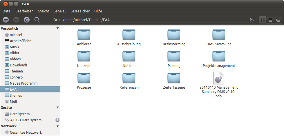 [/g1]
[/g1]
Здесь вы можете найти целую тему: тема атмосферы с темной панелью инструментов
Значки - это персональное сочетание AwOken и Faenza. Я могу опубликовать его, если вы заинтересованы.
Мое измененное gtkrc для атмосферы:
gtk-color-scheme = "base_color:#ffffff\nfg_color:#4c4c4c\ntooltip_fg_color:#ffffff\nselected_bg_color:#7EA2B8\nselected_fg_color:#FFFFFF\ntext_color:#3C3C3C\nbg_color:#F2F1F0\ntooltip_bg_color:#000000\nlink_color:#7EA2B8"

gtk-icon-sizes = "panel-menu=22,22:gtk-button=16,16"

gtk-auto-mnemonics = 1

style "default" {
    xthickness = 1
    ythickness = 1

    #######################
    # Style Properties
    #######################
    GtkWidget::new-tooltip-style = 1
    GtkButton::child-displacement-x = 1
    GtkButton::child-displacement-y = 1
    GtkButton::default-border = { 0, 0, 0, 0 }

    GtkCheckButton::indicator-size = 16

    GtkPaned::handle-size = 0  #MSE

    GtkRange::trough-border = 0
    GtkRange::slider-width = 14
    GtkRange::stepper-size = 16
    GtkRange::trough-under-steppers = 1

    GtkScale::trough-border = 0
    GtkScale::slider-width = 23
    GtkScale::slider-length = 14
    GtkScale::trough-side-details = 1

    GtkScrollbar::activate-slider = 1
    GtkScrollbar::trough-border = 0
    GtkScrollbar::stepper-size = 0
    GtkScrollbar::slider-width = 7
    GtkScrollbar::min-slider-length = 31
    GtkScrollbar::has-backward-stepper  = 0
    GtkScrollbar::has-forward-stepper   = 0

    GtkScrolledWindow::scrollbar-spacing = 2
    GtkScrolledWindow::scrollbars-within-bevel = 1

    GtkMenuBar::internal-padding = 0
    GtkExpander::expander-size = 11
    GtkToolbar::internal-padding = 1
    GtkToolbar::shadow-type = GTK_SHADOW_NONE
#   GtkTreeView::expander-size = 7
#   GtkTreeView::vertical-separator = 0
#   GtkTreeView::odd-row-color = shade (0.96, @base_color) # MSE
    GtkNotebook::tab-overlap = -1

    GtkMenu::horizontal-padding = 0
    GtkMenu::vertical-padding = 0

    WnckTasklist::fade-overlay-rect = 0
    # The following line hints to gecko (and possibly other appliations)
    # that the entry should be drawn transparently on the canvas.
    # Without this, gecko will fill in the background of the entry.
    GtkEntry::honors-transparent-bg-hint = 1
    GtkEntry::state-hint = 0
    GtkEntry::progress-border = { 2, 2, 2, 2 }

    GtkProgressBar::min-horizontal-bar-height = 14
    GtkProgressBar::min-vertical-bar-width = 14

    GtkImage::x-ayatana-indicator-dynamic = 1
    GtkMenuBar::window-dragging = 1

    GtkWidget::link-color = @link_color
    GtkWidget::visited-link-color = @text_color

    ####################
    # Color Definitions
    ####################
    bg[NORMAL]        = @bg_color
    bg[PRELIGHT]      = shade (1.02, @bg_color)
    bg[SELECTED]      = @selected_bg_color
    bg[INSENSITIVE]   = shade (0.95, @bg_color)
    bg[ACTIVE]        = shade (0.9, @bg_color)

    fg[NORMAL]        = @fg_color
    fg[PRELIGHT]      = @fg_color
    fg[SELECTED]      = @selected_fg_color
    fg[INSENSITIVE]   = darker (@bg_color)
    fg[ACTIVE]        = @fg_color

    text[NORMAL]      = @text_color
    text[PRELIGHT]    = @text_color
    text[SELECTED]    = @selected_fg_color
    text[INSENSITIVE] = shade (0.8, @bg_color)
    text[ACTIVE]      = darker (@text_color)

    base[NORMAL]      = @base_color
    base[PRELIGHT]    = shade (0.98, @bg_color)
    base[SELECTED]    = @selected_bg_color
    base[INSENSITIVE] = shade (0.97, @bg_color)
    base[ACTIVE]      = shade (0.94, @bg_color)

    engine "murrine" {
        contrast = 0.6
        arrowstyle = 2
        reliefstyle = 3
        highlight_shade = 1.0
        glazestyle = 0
        default_button_color = shade (1.1, @selected_bg_color)
        gradient_shades = {1.1, 1.0, 1.0, 0.9}
        roundness = 4
        lightborder_shade = 1.26
        lightborderstyle = 1
        listviewstyle = 2
        progressbarstyle = 0
        colorize_scrollbar = TRUE #FALSE #MSE
        menubaritemstyle = 1
        menubarstyle = 1
        menustyle = 2
        focusstyle = 3
        handlestyle = 1
        sliderstyle = 3
        scrollbarstyle = 0 #2
        stepperstyle = 3
#       rgba = TRUE
    }
}

style "dark"
{
    fg[NORMAL]        = "#dfdbd2"
    fg[PRELIGHT]      = "#fff"
    fg[ACTIVE]        = "#fff"
    fg[SELECTED]      = "#fff"
    fg[INSENSITIVE]   = shade (0.5, "#3c3b37")

    bg[NORMAL]        = "#3c3b37"
    bg[PRELIGHT]      = shade (1.0, "#4D4C48")
    bg[ACTIVE]        = shade(0.94, "#3c3b37")
    bg[SELECTED]      = shade(1.0, @selected_bg_color)
    bg[INSENSITIVE]   = "#3c3b37"

    base[NORMAL]      = "#3c3b37" #"#333230"
    base[PRELIGHT]    = shade (0.95, @bg_color)
    base[ACTIVE]      = shade (0.55, @bg_color)
    base[SELECTED]    = shade (1.0, @selected_bg_color)
    base[INSENSITIVE] = @bg_color

    text[NORMAL]      = "#dfdbd2"
    text[PRELIGHT]    = @base_color
    text[ACTIVE]      = @base_color
    text[SELECTED]    = @base_color
    text[INSENSITIVE] = mix (0.5, @bg_color, "#3c3b37")
}

style "narrow" {
    xthickness = 1
    ythickness = 1
}

style "wide" {
    xthickness = 2
    ythickness = 2
}

style "wider" {
    xthickness = 3
    ythickness = 3
}

style "entry" {
    xthickness = 3
    ythickness = 3

    engine "murrine" {
    }
}

style "vscale" {
}

style "hscale" {
}

style "button" = "wider"
{
    bg[NORMAL]   = shade (1.10, @bg_color)
    bg[PRELIGHT] = mix(0.82,shade (1.1, @bg_color),@selected_bg_color)
    bg[ACTIVE]   = shade (0.85, @bg_color)

    engine "murrine"
    {
        border_shades       = { .8, .5} # draw a gradient on the border.
        #border_colors       = { "#D9D4CC", "#D9D4CC" }
        border_colors       = { @bg_color, @bg_color}
        contrast = 1.4
        lightborder_shade = 1.06
    }
}
style "notebook_button" {

    xthickness = 3
    ythickness = 3

    bg[NORMAL] = @bg_color
    bg[PRELIGHT] = shade (1.04, @bg_color)
    bg[ACTIVE] = shade (0.96, @bg_color)
    bg[INSENSITIVE] = @bg_color

    engine "murrine" {
        textstyle = 1
        border_shades = {0.95, 0.88}
        glowstyle = 5
        glow_shade = 1.02
        lightborder_shade = 1.32
    }
}

style "spinbutton" = "notebook_button" {
    xthickness = 4

    engine "murrine" {
    }
}

style "scrollbar" = "button" {  #"button"
    xthickness = 2
    ythickness = 2

    bg[NORMAL] = "#3c3b37"
    bg[PRELIGHT] = shade (1.10, "#3c3b37")
        bg[ACTIVE] = shade (1.10, "#3c3b37")

    engine "murrine"
    {
        border_shades = {0.95, 0.90}
        roundness = 20
        contrast = 1.0
        trough_shades = {0.92, 0.98}
        lightborder_shade = 1.3
        glowstyle = 5
        glow_shade = 1.02
        gradient_shades = {1.2, 1.0, 1.0, 0.86}
        trough_border_shades = {0.9, 0.98}
    }
}

style "hscrollbar" {
}

style "vscrollbar" {
}

style "scale" = "button" {
    bg[NORMAL] = @bg_color
    bg[PRELIGHT] = shade (1.06, @bg_color)
    bg[ACTIVE] = shade (0.94, @bg_color)

    engine "murrine" {
        contrast = 0.6
        border_shades = {0.9, 0.8}
        roundness = 5
        lightborder_shade = 1.32
        gradient_shades = {1.1, 1.0, 1.0, 0.8}
        handlestyle = 2
        trough_border_shades = {0.9, 1.4}
        glow_shade = 1.0
#       reliefstyle = 2
#       shadow_shades = { 1.0, 0.9 }
    }
}

style "notebook_bg" {
    bg[NORMAL] = shade (1.02, @bg_color)
    bg[ACTIVE] = shade (0.97, @bg_color)
    fg[ACTIVE] = mix (0.8, @fg_color, shade (0.97, @bg_color))
}

# The color is changed by the notebook_bg style, this style
# changes the x/ythickness
style "notebook" {
    xthickness = 2
    ythickness = 2

    engine "murrine" {
        roundness = 3
        contrast = 0.8
        focusstyle = 2
        lightborder_shade = 1.16
        gradient_shades = {1.1, 1.0, 1.0, 0.68}
    }
}

style "statusbar" {
    engine "murrine" {
        contrast = 1.2
    }
}

style "comboboxentry" = "notebook_button" {
    xthickness = 3
    ythickness = 3

    engine "murrine" {
        textstyle = 1
        glowstyle = 5
        glow_shade = 1.02
    }
}

style "menubar" = "dark" {
    engine "murrine" {
        textstyle = 2
        text_shade = 0.33
        gradient_shades = {1.0, 1.0, 1.0, 1.0}
        lightborder_shade = 1.23
    }
}
style "dark-toolbar" = "dark"
{
    xthickness = 3
    ythickness = 3
    bg[NORMAL] = "#3c3b37" #"#343330"
    bg[PRELIGHT] =  shade (0.65, @selected_bg_color)
    bg[SELECTED] =  shade (0.35, @bg_color)
    bg[ACTIVE] =  shade (0.35, @bg_color)

    engine "murrine"
    {
        border_shades = {1.3, 1.1} # draw a gradient on the border.
        border_colors = {"#3c3b37", "#3c3b37"}#{ "#343330", "#343330" }
        glowstyle = 4
        gradient_shades = {1.05,1.0,1.0,0.9}
            highlight_shade = 1.1
            lightborder_shade   = 1.05
            reliefstyle = 4     # 0 = flat, 1 = inset, 2 = shadow, = 3 for a gradient on shadow, = 4 for a stronger shadow.
            contrast = 1.4
    }
}

style "dark-toolbar-sep" = "dark-toolbar"
 { xthickness = 2 }


style "pixmap-dark-toolbar" = "dark-toolbar"
{
    xthickness = 1
    ythickness = 1
    # To-do: make the toolbar recolorable, possibly without using pixmaps
    # We only like this because of the top line, anyway.
    engine "pixmap"{
        image {
            function = BOX
            file = "toolbar_o.png"
            border = {1,1,1,1}
        }
        image
        {
              function              = HANDLE
              overlay_file          = "handlebox.png"
              overlay_stretch   = FALSE
              orientation           = HORIZONTAL
            }
            image
        {
              function              = HANDLE
              overlay_file          = "handlebox.png"
              overlay_stretch   = FALSE
              orientation           = VERTICAL
            }
            image
        {
               function        = VLINE
               recolorable        = TRUE
               file                = "blank.png"
        }
        image
        {
              function            = HLINE
              recolorable        = TRUE
              file                = "blank.png"
        }
    }
}


style "toolbar-button" = "notebook-button" {
    engine "murrine" {
    }
}

style "menu" = "dark" {
    xthickness = 0
    ythickness = 0

    bg[NORMAL] = "#43423f"
    bg[INSENSITIVE] = "#43423f"
    fg[INSENSITIVE]   = shade (0.54, "#43423f")

    engine "murrine"
    {
        roundness = 0
    }
}

style "menu_item" = "menu" {
    xthickness = 2
    ythickness = 3

    fg[PRELIGHT] = @selected_fg_color

    engine "murrine"
    {
        glowstyle = 5
        glow_shade = 1.1
        border_shades = {0.95, 0.85}
    }
}

style "menubar_item" = "menu" {
    xthickness = 2
    ythickness = 3

    engine "murrine" {
        gradient_shades = {1.1, 1.0, 1.0, 0.88}
        glowstyle = 5
        glow_shade = 1.0
        border_shades = {1.0, 0.9}
        lightborderstyle = 3
        lightborder_shade = 1.26
    }
}

style "scale_menu_item" = "scale" {
    GtkScale::slider-width = 21
    GtkScale::slider-length = 13

    bg[ACTIVE] = shade(0.98, "#4D4C48")
    bg[INSENSITIVE] = shade (0.9, @bg_color)

    engine "murrine" {
        roundness = 20
        border_shades = {1.4, 1.4}
        reliefstyle = 0
        lightborder_shade = 1.36
    }
}

# This style is there to modify the separator menu items. The goals are:
# 1. Get a specific height.
# 2. The line should go to the edges (ie. no border at the left/right)
style "separator_menu_item" {
    xthickness = 1
    ythickness = 0

    GtkSeparatorMenuItem::horizontal-padding = 0
    GtkWidget::wide-separators = 1
    GtkWidget::separator-width = 1
    GtkWidget::separator-height = 7

    engine "murrine" {
        contrast = 0.6
        separatorstyle = 0
    }
}

style "separator_tool_item" {
    xthickness = 0
    ythickness = 1

    GtkVSeparator::vertical-padding = 0
    GtkWidget::wide-separators = 1
    GtkWidget::separator-width = 7
    GtkWidget::separator-height = 1

    engine "murrine" {
        contrast = 0.6
        separatorstyle = 0
    }
}

style "frame_title" {
    fg[NORMAL] = lighter (@fg_color)
}

style "treeview" {
    engine "murrine"
    {
        roundness = 2
        lightborder_shade = 1.1
        gradient_shades = {1.04, 1.0, 1.0, 0.96}
    }
}

style "progressbar" {
    xthickness = 1
    ythickness = 1

    bg[ACTIVE] = shade (0.94, @bg_color)
    fg[PRELIGHT] = @selected_fg_color
    #bg[SELECTED] = "#cdcdcd"

    engine "murrine" {
        #trough_shades = {0.98, 1.02}
        roundness = 8
        lightborderstyle = 1
        lightborder_shade = 1.26
        border_shades = {0.95, 0.85}
        gradient_shades = {1.1, 1.0, 1.0, 0.9}
        trough_border_shades = {0.9, 1.4}
    }
}

style "progressbar_menu_item" = "progressbar" {
    bg[ACTIVE] = shade(0.98, "#4D4C48")

    engine "murrine" {
        roundness = 0
    }
}

# This style is based on the default style, so that the colors from the button
# style are overriden again.
style "treeview_header" = "notebook_button" {
    xthickness = 2
    ythickness = 1

    engine "murrine" {
        glazestyle = 1
        contrast = 0.8
        lightborder_shade = 1.16
        textstyle = 1
        glow_shade = 1.0
    }
}

style "treeview_header_scrolled" = "treeview_header" {
}

style "scrolledwindow" {
    engine "murrine" {
        contrast = 0.6
    }
}

style "radiocheck"  = "button" {
    text[NORMAL] = shade (0.535, @selected_bg_color)
    text[PRELIGHT] = shade(1.06, shade (0.535, @selected_bg_color))
    bg[NORMAL]   = shade (0.92, @bg_color)
    bg[PRELIGHT] = mix (0.2, @selected_bg_color, shade(1.1, @bg_color))
    fg[INSENSITIVE] = darker (@bg_color)
    fg[ACTIVE] = @fg_color

    engine "murrine" {
        reliefstyle = 3
        gradient_shades = {1.2, 1.0, 1.0, 0.9}
        shadow_shades = {0.6, 0.5}
        textstyle = 0
    }
}

style "tooltips" {
    xthickness = 4
    ythickness = 4

    bg[NORMAL]        = @tooltip_bg_color
    fg[NORMAL]        = @tooltip_fg_color
    bg[SELECTED]      = "#000000"

    engine "murrine" {
        rgba = TRUE
    }
}

style "infobar" {
    engine "murrine" {
    }
}

style "nautilus_location" {
    bg[NORMAL]  = mix (0.60, shade (1.05, @bg_color), @selected_bg_color)

}

style "nautilus-sidepane" {
    GtkTreeView::expander-size = 7
    GtkTreeView::vertical-separator = 0
    GtkWidget::separator-height = 0
        GtkTreeView::horizontal-separator = 0 # add extra the padding
    GtkTreeView::odd-row-color = @base_color
    GtkTreeView::even-row-color = @bg_color #"#CBD9E2"
}

style "calendar" {
    xthickness = 0
    ythickness = 0

    engine "murrine" {
        roundness = 0
    }
}

style "calendar_menu_item" = "calendar" {
    base[NORMAL] = "#605E58"
    base[ACTIVE] = "#4b4944"
}

style "iconview" {
    engine "murrine" {
        roundness = 6
        border_shades = {1.16, 1.0}
        glow_shade = 1.1
        glowstyle = 5
    }
}

style "soundfix"
{
}

# Wrokaround style for places where the text color is used instead of the fg color.
style "text_is_fg_color_workaround" {
    text[NORMAL]      = @fg_color
    text[PRELIGHT]    = @fg_color
    text[SELECTED]    = @selected_fg_color
    text[ACTIVE]      = @fg_color
    text[INSENSITIVE] = darker (@bg_color)
}

# Workaround style for menus where the text color is used instead of the fg color.
style "menuitem_text_is_fg_color_workaround" {
    text[NORMAL]        = "#dfd8c8"
    text[PRELIGHT]      = @selected_fg_color
    text[SELECTED]      = @selected_fg_color
    text[ACTIVE]        = @fg_color
    text[INSENSITIVE]   = "#99958b"
}

# Workaround style for places where the fg color is used instead of the text color.
style "fg_is_text_color_workaround" {
    fg[NORMAL]        = @text_color
    fg[PRELIGHT]      = @text_color
    fg[SELECTED]      = @selected_fg_color
    fg[ACTIVE]        = @selected_fg_color
    fg[INSENSITIVE]   = darker (@bg_color)
}

# Style to set the toolbar to use a flat style. This is because the "New" button in
# Evolution is not drawn transparent. So if there is a gradient in the background it will
# look really wrong.
# See http://bugzilla.gnome.org/show_bug.cgi?id=446953.
style "evo_new_button_workaround" {
}

###############################################################################
# The following part of the gtkrc applies the different styles to the widgets.
###############################################################################

# The default style is applied to every widget
class "GtkWidget" style "default"

class "GtkSeparator" style "narrow" #"wide"
class "GtkFrame" style "narrow" #"wide"
class "GtkCalendar" style "wide"
class "GtkEntry" style "entry"

class "GtkSpinButton" style "spinbutton"
class "GtkScale" style "scale"
class "GtkVScale" style "vscale"
class "GtkHScale" style "hscale"
class "GtkScrollbar" style "scrollbar"
class "GtkHScrollbar" style "hscrollbar"
class "GtkVScrollbar" style "vscrollbar"
class "GtkCalendar" style "calendar"
class "GtkInfoBar" style "infobar"
class "GtkIconView" style "iconview"

# General matching follows. The order is choosen so that the right styles override
# each other. EG. progressbar needs to be more important than the menu match.
widget_class "*<GtkNotebook>" style "notebook_bg"
# This is not perfect, it could be done better.
# (That is modify *every* widget in the notebook, and change those back that
# we really don't want changed)
widget_class "*<GtkNotebook>*<GtkEventBox>" style "notebook_bg"
widget_class "*<GtkNotebook>*<GtkDrawingArea>" style "notebook_bg"
widget_class "*<GtkNotebook>*<GtkLayout>" style "notebook_bg"
widget_class "*<GtkNotebook>*<GtkLabel>" style "notebook_bg"
widget_class "*<GtkScrolledWindow>*" style "scrolledwindow"


# Toolbar default: dark
class "*HandleBox" style "pixmap-dark-toolbar"
class "GtkToolbar"   style "pixmap-dark-toolbar"
widget_class "*HandleBox" style "pixmap-dark-toolbar"
widget_class "*<GtkToolbar>.*"   style "dark-toolbar"
widget_class "*<GtkToolbar>*<GtkEntry>*" style "pixmap-dark-toolbar"

widget_class "*<GtkButton>" style "button"
widget_class "*<GtkButton>*<GtkLabel>" style "button"
widget_class "*<GtkNotebook>" style "notebook"
widget_class "*<GtkStatusbar>" style "statusbar"
widget_class "*<GtkSpinButton>*" style "spinbutton"
widget_class "*<GtkNotebook>*<GtkButton>" style "notebook_button"
widget_class "*<GtkNotebook>*<GtkButton>*<GtkLabel>" style "notebook_button"
widget_class "*<GtkRadioButton>*" style "radiocheck"
widget_class "*<GtkCheckButton>*" style "radiocheck"

widget_class "*<GtkComboBoxEntry>*" style "comboboxentry"
widget_class "*<GtkCombo>*" style "comboboxentry"

widget_class "*<GtkMenuBar>*" style "menubar"
widget_class "*<GtkMenu>*" style "menu"
widget_class "*<GtkMenuItem>*" style "menu_item"
widget_class "*<GtkSeparatorMenuItem>*" style "separator_menu_item"
widget_class "*<GtkSeparatorToolItem>*" style "separator_tool_item"
widget_class "*<GtkMenuBar>*<GtkMenuItem>*" style "menubar_item"

widget_class "*.<GtkFrame>.<GtkLabel>" style "frame_title"
widget_class "*.<GtkTreeView>*" style "treeview"

widget_class "*<GtkProgress>" style "progressbar"
widget_class "*<GtkMenuItem>.*.<GtkProgressBar>" style "progressbar_menu_item"
widget_class "*<GtkMenuItem>.*.<GtkScale>" style "scale_menu_item"
widget_class "*<GtkMenuItem>.*.<GtkCalendar>" style "calendar_menu_item"

# Treeview headers (and similar stock GTK+ widgets)
widget_class "*.<GtkScrolledWindow>*<GtkTreeView>*" style "treeview_header_scrolled"
widget_class "*.<GtkTreeView>.<GtkButton>" style "treeview_header"
widget_class "*.<GtkCTree>.<GtkButton>" style "treeview_header"
widget_class "*.<GtkList>.<GtkButton>" style "treeview_header"
widget_class "*.<GtkCList>.<GtkButton>" style "treeview_header"
widget_class "*.<GtkTreeView>.<GtkButton>.*<GtkLabel>" style "treeview_header"
widget_class "*.<GtkCTree>.<GtkButton>.*<GtkLabel>" style "treeview_header"
widget_class "*.<GtkList>.<GtkButton>.*<GtkLabel>" style "treeview_header"
widget_class "*.<GtkCList>.<GtkButton>.*<GtkLabel>" style "treeview_header"

# The window of the tooltip is called "gtk-tooltip"
##################################################################
# FIXME:
# This will not work if one embeds eg. a button into the tooltip.
# As far as I can tell right now we will need to rework the theme
# quite a bit to get this working correctly.
# (It will involve setting different priorities, etc.)
##################################################################
widget "gtk-tooltip*" style "tooltips"

##########################################################################
# Following are special cases and workarounds for issues in applications.
##########################################################################

# Workaround for the evolution ETable (bug #527532)
widget_class "*.ETable.ECanvas" style "treeview_header"
# Workaround for the evolution ETree
widget_class "*.ETree.ECanvas" style "treeview_header"

# Special case the nautilus-extra-view-widget
# ToDo: A more generic approach for all applications that have a widget like this.
widget "*.nautilus-extra-view-widget" style : highest "nautilus_location"
widget_class "*NautilusSidePane*" style "nautilus-sidepane"
#widget_class "*NautilusNavigationWindow*" style "nautilus-sidepane"

# Work around for http://bugzilla.gnome.org/show_bug.cgi?id=382646
# Note that this work around assumes that the combobox is _not_ in appears-as-list mode.
widget_class "*.<GtkComboBox>.<GtkCellView>" style "text_is_fg_color_workaround"
# This is the part of the workaround that fixes the menus
widget "*.gtk-combobox-popup-menu.*" style "menuitem_text_is_fg_color_workaround"

# Work around the usage of GtkLabel inside GtkListItems to display text.
# This breaks because the label is shown on a background that is based on the base color.
widget_class "*<GtkListItem>*" style "fg_is_text_color_workaround"
# GtkCList also uses the fg color to draw text on top of the base colors.
widget_class "*<GtkCList>" style "fg_is_text_color_workaround"
# Nautilus when renaming files, and maybe other places.
#widget_class "*<EelEditableLabel>" style "fg_is_text_color_workaround"
# Work around for ubuntu's lucid sound indicator
widget "ido-offscreen-scale" style "soundfix"
# Thickness for indicator menu items
widget "*IdoEntryMenuItem*" style "wide"

# See the documentation of the style.
widget_class "EShellWindow.GtkVBox.BonoboDock.BonoboDockBand.BonoboDockItem*" style "evo_new_button_workaround"

# Includes
include "apps/banshee.rc"
include "apps/chromium.rc"
include "apps/ff.rc"
include "apps/gnome-panel.rc"
include "apps/gnome-terminal.rc"
Я изменил тему атмосферы на темные панели инструментов (включая nautilus, banshee и т. д.) и некоторые другие изменения в виде небольших полос прокрутки. Мои изменения основаны на теме Wasp (см. Gnome-look).
Это выглядит так: [/g1]
Здесь вы можете найти целую тему: тема атмосферы с темной панелью инструментов
Значки - это персональное сочетание AwOken и Faenza. Я могу опубликовать его, если вы заинтересованы.
Мое измененное gtkrc для атмосферы:
gtk-color-scheme = "base_color:#ffffff\nfg_color:#4c4c4c\ntooltip_fg_color:#ffffff\nselected_bg_color:#7EA2B8\nselected_fg_color:#FFFFFF\ntext_color:#3C3C3C\nbg_color:#F2F1F0\ntooltip_bg_color:#000000\nlink_color:#7EA2B8"

gtk-icon-sizes = "panel-menu=22,22:gtk-button=16,16"

gtk-auto-mnemonics = 1

style "default" {
    xthickness = 1
    ythickness = 1

    #######################
    # Style Properties
    #######################
    GtkWidget::new-tooltip-style = 1
    GtkButton::child-displacement-x = 1
    GtkButton::child-displacement-y = 1
    GtkButton::default-border = { 0, 0, 0, 0 }

    GtkCheckButton::indicator-size = 16

    GtkPaned::handle-size = 0  #MSE

    GtkRange::trough-border = 0
    GtkRange::slider-width = 14
    GtkRange::stepper-size = 16
    GtkRange::trough-under-steppers = 1

    GtkScale::trough-border = 0
    GtkScale::slider-width = 23
    GtkScale::slider-length = 14
    GtkScale::trough-side-details = 1

    GtkScrollbar::activate-slider = 1
    GtkScrollbar::trough-border = 0
    GtkScrollbar::stepper-size = 0
    GtkScrollbar::slider-width = 7
    GtkScrollbar::min-slider-length = 31
    GtkScrollbar::has-backward-stepper  = 0
    GtkScrollbar::has-forward-stepper   = 0

    GtkScrolledWindow::scrollbar-spacing = 2
    GtkScrolledWindow::scrollbars-within-bevel = 1

    GtkMenuBar::internal-padding = 0
    GtkExpander::expander-size = 11
    GtkToolbar::internal-padding = 1
    GtkToolbar::shadow-type = GTK_SHADOW_NONE
#   GtkTreeView::expander-size = 7
#   GtkTreeView::vertical-separator = 0
#   GtkTreeView::odd-row-color = shade (0.96, @base_color) # MSE
    GtkNotebook::tab-overlap = -1

    GtkMenu::horizontal-padding = 0
    GtkMenu::vertical-padding = 0

    WnckTasklist::fade-overlay-rect = 0
    # The following line hints to gecko (and possibly other appliations)
    # that the entry should be drawn transparently on the canvas.
    # Without this, gecko will fill in the background of the entry.
    GtkEntry::honors-transparent-bg-hint = 1
    GtkEntry::state-hint = 0
    GtkEntry::progress-border = { 2, 2, 2, 2 }

    GtkProgressBar::min-horizontal-bar-height = 14
    GtkProgressBar::min-vertical-bar-width = 14

    GtkImage::x-ayatana-indicator-dynamic = 1
    GtkMenuBar::window-dragging = 1

    GtkWidget::link-color = @link_color
    GtkWidget::visited-link-color = @text_color

    ####################
    # Color Definitions
    ####################
    bg[NORMAL]        = @bg_color
    bg[PRELIGHT]      = shade (1.02, @bg_color)
    bg[SELECTED]      = @selected_bg_color
    bg[INSENSITIVE]   = shade (0.95, @bg_color)
    bg[ACTIVE]        = shade (0.9, @bg_color)

    fg[NORMAL]        = @fg_color
    fg[PRELIGHT]      = @fg_color
    fg[SELECTED]      = @selected_fg_color
    fg[INSENSITIVE]   = darker (@bg_color)
    fg[ACTIVE]        = @fg_color

    text[NORMAL]      = @text_color
    text[PRELIGHT]    = @text_color
    text[SELECTED]    = @selected_fg_color
    text[INSENSITIVE] = shade (0.8, @bg_color)
    text[ACTIVE]      = darker (@text_color)

    base[NORMAL]      = @base_color
    base[PRELIGHT]    = shade (0.98, @bg_color)
    base[SELECTED]    = @selected_bg_color
    base[INSENSITIVE] = shade (0.97, @bg_color)
    base[ACTIVE]      = shade (0.94, @bg_color)

    engine "murrine" {
        contrast = 0.6
        arrowstyle = 2
        reliefstyle = 3
        highlight_shade = 1.0
        glazestyle = 0
        default_button_color = shade (1.1, @selected_bg_color)
        gradient_shades = {1.1, 1.0, 1.0, 0.9}
        roundness = 4
        lightborder_shade = 1.26
        lightborderstyle = 1
        listviewstyle = 2
        progressbarstyle = 0
        colorize_scrollbar = TRUE #FALSE #MSE
        menubaritemstyle = 1
        menubarstyle = 1
        menustyle = 2
        focusstyle = 3
        handlestyle = 1
        sliderstyle = 3
        scrollbarstyle = 0 #2
        stepperstyle = 3
#       rgba = TRUE
    }
}

style "dark"
{
    fg[NORMAL]        = "#dfdbd2"
    fg[PRELIGHT]      = "#fff"
    fg[ACTIVE]        = "#fff"
    fg[SELECTED]      = "#fff"
    fg[INSENSITIVE]   = shade (0.5, "#3c3b37")

    bg[NORMAL]        = "#3c3b37"
    bg[PRELIGHT]      = shade (1.0, "#4D4C48")
    bg[ACTIVE]        = shade(0.94, "#3c3b37")
    bg[SELECTED]      = shade(1.0, @selected_bg_color)
    bg[INSENSITIVE]   = "#3c3b37"

    base[NORMAL]      = "#3c3b37" #"#333230"
    base[PRELIGHT]    = shade (0.95, @bg_color)
    base[ACTIVE]      = shade (0.55, @bg_color)
    base[SELECTED]    = shade (1.0, @selected_bg_color)
    base[INSENSITIVE] = @bg_color

    text[NORMAL]      = "#dfdbd2"
    text[PRELIGHT]    = @base_color
    text[ACTIVE]      = @base_color
    text[SELECTED]    = @base_color
    text[INSENSITIVE] = mix (0.5, @bg_color, "#3c3b37")
}

style "narrow" {
    xthickness = 1
    ythickness = 1
}

style "wide" {
    xthickness = 2
    ythickness = 2
}

style "wider" {
    xthickness = 3
    ythickness = 3
}

style "entry" {
    xthickness = 3
    ythickness = 3

    engine "murrine" {
    }
}

style "vscale" {
}

style "hscale" {
}

style "button" = "wider"
{
    bg[NORMAL]   = shade (1.10, @bg_color)
    bg[PRELIGHT] = mix(0.82,shade (1.1, @bg_color),@selected_bg_color)
    bg[ACTIVE]   = shade (0.85, @bg_color)

    engine "murrine"
    {
        border_shades       = { .8, .5} # draw a gradient on the border.
        #border_colors       = { "#D9D4CC", "#D9D4CC" }
        border_colors       = { @bg_color, @bg_color}
        contrast = 1.4
        lightborder_shade = 1.06
    }
}
style "notebook_button" {

    xthickness = 3
    ythickness = 3

    bg[NORMAL] = @bg_color
    bg[PRELIGHT] = shade (1.04, @bg_color)
    bg[ACTIVE] = shade (0.96, @bg_color)
    bg[INSENSITIVE] = @bg_color

    engine "murrine" {
        textstyle = 1
        border_shades = {0.95, 0.88}
        glowstyle = 5
        glow_shade = 1.02
        lightborder_shade = 1.32
    }
}

style "spinbutton" = "notebook_button" {
    xthickness = 4

    engine "murrine" {
    }
}

style "scrollbar" = "button" {  #"button"
    xthickness = 2
    ythickness = 2

    bg[NORMAL] = "#3c3b37"
    bg[PRELIGHT] = shade (1.10, "#3c3b37")
        bg[ACTIVE] = shade (1.10, "#3c3b37")

    engine "murrine"
    {
        border_shades = {0.95, 0.90}
        roundness = 20
        contrast = 1.0
        trough_shades = {0.92, 0.98}
        lightborder_shade = 1.3
        glowstyle = 5
        glow_shade = 1.02
        gradient_shades = {1.2, 1.0, 1.0, 0.86}
        trough_border_shades = {0.9, 0.98}
    }
}

style "hscrollbar" {
}

style "vscrollbar" {
}

style "scale" = "button" {
    bg[NORMAL] = @bg_color
    bg[PRELIGHT] = shade (1.06, @bg_color)
    bg[ACTIVE] = shade (0.94, @bg_color)

    engine "murrine" {
        contrast = 0.6
        border_shades = {0.9, 0.8}
        roundness = 5
        lightborder_shade = 1.32
        gradient_shades = {1.1, 1.0, 1.0, 0.8}
        handlestyle = 2
        trough_border_shades = {0.9, 1.4}
        glow_shade = 1.0
#       reliefstyle = 2
#       shadow_shades = { 1.0, 0.9 }
    }
}

style "notebook_bg" {
    bg[NORMAL] = shade (1.02, @bg_color)
    bg[ACTIVE] = shade (0.97, @bg_color)
    fg[ACTIVE] = mix (0.8, @fg_color, shade (0.97, @bg_color))
}

# The color is changed by the notebook_bg style, this style
# changes the x/ythickness
style "notebook" {
    xthickness = 2
    ythickness = 2

    engine "murrine" {
        roundness = 3
        contrast = 0.8
        focusstyle = 2
        lightborder_shade = 1.16
        gradient_shades = {1.1, 1.0, 1.0, 0.68}
    }
}

style "statusbar" {
    engine "murrine" {
        contrast = 1.2
    }
}

style "comboboxentry" = "notebook_button" {
    xthickness = 3
    ythickness = 3

    engine "murrine" {
        textstyle = 1
        glowstyle = 5
        glow_shade = 1.02
    }
}

style "menubar" = "dark" {
    engine "murrine" {
        textstyle = 2
        text_shade = 0.33
        gradient_shades = {1.0, 1.0, 1.0, 1.0}
        lightborder_shade = 1.23
    }
}
style "dark-toolbar" = "dark"
{
    xthickness = 3
    ythickness = 3
    bg[NORMAL] = "#3c3b37" #"#343330"
    bg[PRELIGHT] =  shade (0.65, @selected_bg_color)
    bg[SELECTED] =  shade (0.35, @bg_color)
    bg[ACTIVE] =  shade (0.35, @bg_color)

    engine "murrine"
    {
        border_shades = {1.3, 1.1} # draw a gradient on the border.
        border_colors = {"#3c3b37", "#3c3b37"}#{ "#343330", "#343330" }
        glowstyle = 4
        gradient_shades = {1.05,1.0,1.0,0.9}
            highlight_shade = 1.1
            lightborder_shade   = 1.05
            reliefstyle = 4     # 0 = flat, 1 = inset, 2 = shadow, = 3 for a gradient on shadow, = 4 for a stronger shadow.
            contrast = 1.4
    }
}

style "dark-toolbar-sep" = "dark-toolbar"
 { xthickness = 2 }


style "pixmap-dark-toolbar" = "dark-toolbar"
{
    xthickness = 1
    ythickness = 1
    # To-do: make the toolbar recolorable, possibly without using pixmaps
    # We only like this because of the top line, anyway.
    engine "pixmap"{
        image {
            function = BOX
            file = "toolbar_o.png"
            border = {1,1,1,1}
        }
        image
        {
              function              = HANDLE
              overlay_file          = "handlebox.png"
              overlay_stretch   = FALSE
              orientation           = HORIZONTAL
            }
            image
        {
              function              = HANDLE
              overlay_file          = "handlebox.png"
              overlay_stretch   = FALSE
              orientation           = VERTICAL
            }
            image
        {
               function        = VLINE
               recolorable        = TRUE
               file                = "blank.png"
        }
        image
        {
              function            = HLINE
              recolorable        = TRUE
              file                = "blank.png"
        }
    }
}


style "toolbar-button" = "notebook-button" {
    engine "murrine" {
    }
}

style "menu" = "dark" {
    xthickness = 0
    ythickness = 0

    bg[NORMAL] = "#43423f"
    bg[INSENSITIVE] = "#43423f"
    fg[INSENSITIVE]   = shade (0.54, "#43423f")

    engine "murrine"
    {
        roundness = 0
    }
}

style "menu_item" = "menu" {
    xthickness = 2
    ythickness = 3

    fg[PRELIGHT] = @selected_fg_color

    engine "murrine"
    {
        glowstyle = 5
        glow_shade = 1.1
        border_shades = {0.95, 0.85}
    }
}

style "menubar_item" = "menu" {
    xthickness = 2
    ythickness = 3

    engine "murrine" {
        gradient_shades = {1.1, 1.0, 1.0, 0.88}
        glowstyle = 5
        glow_shade = 1.0
        border_shades = {1.0, 0.9}
        lightborderstyle = 3
        lightborder_shade = 1.26
    }
}

style "scale_menu_item" = "scale" {
    GtkScale::slider-width = 21
    GtkScale::slider-length = 13

    bg[ACTIVE] = shade(0.98, "#4D4C48")
    bg[INSENSITIVE] = shade (0.9, @bg_color)

    engine "murrine" {
        roundness = 20
        border_shades = {1.4, 1.4}
        reliefstyle = 0
        lightborder_shade = 1.36
    }
}

# This style is there to modify the separator menu items. The goals are:
# 1. Get a specific height.
# 2. The line should go to the edges (ie. no border at the left/right)
style "separator_menu_item" {
    xthickness = 1
    ythickness = 0

    GtkSeparatorMenuItem::horizontal-padding = 0
    GtkWidget::wide-separators = 1
    GtkWidget::separator-width = 1
    GtkWidget::separator-height = 7

    engine "murrine" {
        contrast = 0.6
        separatorstyle = 0
    }
}

style "separator_tool_item" {
    xthickness = 0
    ythickness = 1

    GtkVSeparator::vertical-padding = 0
    GtkWidget::wide-separators = 1
    GtkWidget::separator-width = 7
    GtkWidget::separator-height = 1

    engine "murrine" {
        contrast = 0.6
        separatorstyle = 0
    }
}

style "frame_title" {
    fg[NORMAL] = lighter (@fg_color)
}

style "treeview" {
    engine "murrine"
    {
        roundness = 2
        lightborder_shade = 1.1
        gradient_shades = {1.04, 1.0, 1.0, 0.96}
    }
}

style "progressbar" {
    xthickness = 1
    ythickness = 1

    bg[ACTIVE] = shade (0.94, @bg_color)
    fg[PRELIGHT] = @selected_fg_color
    #bg[SELECTED] = "#cdcdcd"

    engine "murrine" {
        #trough_shades = {0.98, 1.02}
        roundness = 8
        lightborderstyle = 1
        lightborder_shade = 1.26
        border_shades = {0.95, 0.85}
        gradient_shades = {1.1, 1.0, 1.0, 0.9}
        trough_border_shades = {0.9, 1.4}
    }
}

style "progressbar_menu_item" = "progressbar" {
    bg[ACTIVE] = shade(0.98, "#4D4C48")

    engine "murrine" {
        roundness = 0
    }
}

# This style is based on the default style, so that the colors from the button
# style are overriden again.
style "treeview_header" = "notebook_button" {
    xthickness = 2
    ythickness = 1

    engine "murrine" {
        glazestyle = 1
        contrast = 0.8
        lightborder_shade = 1.16
        textstyle = 1
        glow_shade = 1.0
    }
}

style "treeview_header_scrolled" = "treeview_header" {
}

style "scrolledwindow" {
    engine "murrine" {
        contrast = 0.6
    }
}

style "radiocheck"  = "button" {
    text[NORMAL] = shade (0.535, @selected_bg_color)
    text[PRELIGHT] = shade(1.06, shade (0.535, @selected_bg_color))
    bg[NORMAL]   = shade (0.92, @bg_color)
    bg[PRELIGHT] = mix (0.2, @selected_bg_color, shade(1.1, @bg_color))
    fg[INSENSITIVE] = darker (@bg_color)
    fg[ACTIVE] = @fg_color

    engine "murrine" {
        reliefstyle = 3
        gradient_shades = {1.2, 1.0, 1.0, 0.9}
        shadow_shades = {0.6, 0.5}
        textstyle = 0
    }
}

style "tooltips" {
    xthickness = 4
    ythickness = 4

    bg[NORMAL]        = @tooltip_bg_color
    fg[NORMAL]        = @tooltip_fg_color
    bg[SELECTED]      = "#000000"

    engine "murrine" {
        rgba = TRUE
    }
}

style "infobar" {
    engine "murrine" {
    }
}

style "nautilus_location" {
    bg[NORMAL]  = mix (0.60, shade (1.05, @bg_color), @selected_bg_color)

}

style "nautilus-sidepane" {
    GtkTreeView::expander-size = 7
    GtkTreeView::vertical-separator = 0
    GtkWidget::separator-height = 0
        GtkTreeView::horizontal-separator = 0 # add extra the padding
    GtkTreeView::odd-row-color = @base_color
    GtkTreeView::even-row-color = @bg_color #"#CBD9E2"
}

style "calendar" {
    xthickness = 0
    ythickness = 0

    engine "murrine" {
        roundness = 0
    }
}

style "calendar_menu_item" = "calendar" {
    base[NORMAL] = "#605E58"
    base[ACTIVE] = "#4b4944"
}

style "iconview" {
    engine "murrine" {
        roundness = 6
        border_shades = {1.16, 1.0}
        glow_shade = 1.1
        glowstyle = 5
    }
}

style "soundfix"
{
}

# Wrokaround style for places where the text color is used instead of the fg color.
style "text_is_fg_color_workaround" {
    text[NORMAL]      = @fg_color
    text[PRELIGHT]    = @fg_color
    text[SELECTED]    = @selected_fg_color
    text[ACTIVE]      = @fg_color
    text[INSENSITIVE] = darker (@bg_color)
}

# Workaround style for menus where the text color is used instead of the fg color.
style "menuitem_text_is_fg_color_workaround" {
    text[NORMAL]        = "#dfd8c8"
    text[PRELIGHT]      = @selected_fg_color
    text[SELECTED]      = @selected_fg_color
    text[ACTIVE]        = @fg_color
    text[INSENSITIVE]   = "#99958b"
}

# Workaround style for places where the fg color is used instead of the text color.
style "fg_is_text_color_workaround" {
    fg[NORMAL]        = @text_color
    fg[PRELIGHT]      = @text_color
    fg[SELECTED]      = @selected_fg_color
    fg[ACTIVE]        = @selected_fg_color
    fg[INSENSITIVE]   = darker (@bg_color)
}

# Style to set the toolbar to use a flat style. This is because the "New" button in
# Evolution is not drawn transparent. So if there is a gradient in the background it will
# look really wrong.
# See http://bugzilla.gnome.org/show_bug.cgi?id=446953.
style "evo_new_button_workaround" {
}

###############################################################################
# The following part of the gtkrc applies the different styles to the widgets.
###############################################################################

# The default style is applied to every widget
class "GtkWidget" style "default"

class "GtkSeparator" style "narrow" #"wide"
class "GtkFrame" style "narrow" #"wide"
class "GtkCalendar" style "wide"
class "GtkEntry" style "entry"

class "GtkSpinButton" style "spinbutton"
class "GtkScale" style "scale"
class "GtkVScale" style "vscale"
class "GtkHScale" style "hscale"
class "GtkScrollbar" style "scrollbar"
class "GtkHScrollbar" style "hscrollbar"
class "GtkVScrollbar" style "vscrollbar"
class "GtkCalendar" style "calendar"
class "GtkInfoBar" style "infobar"
class "GtkIconView" style "iconview"

# General matching follows. The order is choosen so that the right styles override
# each other. EG. progressbar needs to be more important than the menu match.
widget_class "*<GtkNotebook>" style "notebook_bg"
# This is not perfect, it could be done better.
# (That is modify *every* widget in the notebook, and change those back that
# we really don't want changed)
widget_class "*<GtkNotebook>*<GtkEventBox>" style "notebook_bg"
widget_class "*<GtkNotebook>*<GtkDrawingArea>" style "notebook_bg"
widget_class "*<GtkNotebook>*<GtkLayout>" style "notebook_bg"
widget_class "*<GtkNotebook>*<GtkLabel>" style "notebook_bg"
widget_class "*<GtkScrolledWindow>*" style "scrolledwindow"


# Toolbar default: dark
class "*HandleBox" style "pixmap-dark-toolbar"
class "GtkToolbar"   style "pixmap-dark-toolbar"
widget_class "*HandleBox" style "pixmap-dark-toolbar"
widget_class "*<GtkToolbar>.*"   style "dark-toolbar"
widget_class "*<GtkToolbar>*<GtkEntry>*" style "pixmap-dark-toolbar"

widget_class "*<GtkButton>" style "button"
widget_class "*<GtkButton>*<GtkLabel>" style "button"
widget_class "*<GtkNotebook>" style "notebook"
widget_class "*<GtkStatusbar>" style "statusbar"
widget_class "*<GtkSpinButton>*" style "spinbutton"
widget_class "*<GtkNotebook>*<GtkButton>" style "notebook_button"
widget_class "*<GtkNotebook>*<GtkButton>*<GtkLabel>" style "notebook_button"
widget_class "*<GtkRadioButton>*" style "radiocheck"
widget_class "*<GtkCheckButton>*" style "radiocheck"

widget_class "*<GtkComboBoxEntry>*" style "comboboxentry"
widget_class "*<GtkCombo>*" style "comboboxentry"

widget_class "*<GtkMenuBar>*" style "menubar"
widget_class "*<GtkMenu>*" style "menu"
widget_class "*<GtkMenuItem>*" style "menu_item"
widget_class "*<GtkSeparatorMenuItem>*" style "separator_menu_item"
widget_class "*<GtkSeparatorToolItem>*" style "separator_tool_item"
widget_class "*<GtkMenuBar>*<GtkMenuItem>*" style "menubar_item"

widget_class "*.<GtkFrame>.<GtkLabel>" style "frame_title"
widget_class "*.<GtkTreeView>*" style "treeview"

widget_class "*<GtkProgress>" style "progressbar"
widget_class "*<GtkMenuItem>.*.<GtkProgressBar>" style "progressbar_menu_item"
widget_class "*<GtkMenuItem>.*.<GtkScale>" style "scale_menu_item"
widget_class "*<GtkMenuItem>.*.<GtkCalendar>" style "calendar_menu_item"

# Treeview headers (and similar stock GTK+ widgets)
widget_class "*.<GtkScrolledWindow>*<GtkTreeView>*" style "treeview_header_scrolled"
widget_class "*.<GtkTreeView>.<GtkButton>" style "treeview_header"
widget_class "*.<GtkCTree>.<GtkButton>" style "treeview_header"
widget_class "*.<GtkList>.<GtkButton>" style "treeview_header"
widget_class "*.<GtkCList>.<GtkButton>" style "treeview_header"
widget_class "*.<GtkTreeView>.<GtkButton>.*<GtkLabel>" style "treeview_header"
widget_class "*.<GtkCTree>.<GtkButton>.*<GtkLabel>" style "treeview_header"
widget_class "*.<GtkList>.<GtkButton>.*<GtkLabel>" style "treeview_header"
widget_class "*.<GtkCList>.<GtkButton>.*<GtkLabel>" style "treeview_header"

# The window of the tooltip is called "gtk-tooltip"
##################################################################
# FIXME:
# This will not work if one embeds eg. a button into the tooltip.
# As far as I can tell right now we will need to rework the theme
# quite a bit to get this working correctly.
# (It will involve setting different priorities, etc.)
##################################################################
widget "gtk-tooltip*" style "tooltips"

##########################################################################
# Following are special cases and workarounds for issues in applications.
##########################################################################

# Workaround for the evolution ETable (bug #527532)
widget_class "*.ETable.ECanvas" style "treeview_header"
# Workaround for the evolution ETree
widget_class "*.ETree.ECanvas" style "treeview_header"

# Special case the nautilus-extra-view-widget
# ToDo: A more generic approach for all applications that have a widget like this.
widget "*.nautilus-extra-view-widget" style : highest "nautilus_location"
widget_class "*NautilusSidePane*" style "nautilus-sidepane"
#widget_class "*NautilusNavigationWindow*" style "nautilus-sidepane"

# Work around for http://bugzilla.gnome.org/show_bug.cgi?id=382646
# Note that this work around assumes that the combobox is _not_ in appears-as-list mode.
widget_class "*.<GtkComboBox>.<GtkCellView>" style "text_is_fg_color_workaround"
# This is the part of the workaround that fixes the menus
widget "*.gtk-combobox-popup-menu.*" style "menuitem_text_is_fg_color_workaround"

# Work around the usage of GtkLabel inside GtkListItems to display text.
# This breaks because the label is shown on a background that is based on the base color.
widget_class "*<GtkListItem>*" style "fg_is_text_color_workaround"
# GtkCList also uses the fg color to draw text on top of the base colors.
widget_class "*<GtkCList>" style "fg_is_text_color_workaround"
# Nautilus when renaming files, and maybe other places.
#widget_class "*<EelEditableLabel>" style "fg_is_text_color_workaround"
# Work around for ubuntu's lucid sound indicator
widget "ido-offscreen-scale" style "soundfix"
# Thickness for indicator menu items
widget "*IdoEntryMenuItem*" style "wide"

# See the documentation of the style.
widget_class "EShellWindow.GtkVBox.BonoboDock.BonoboDockBand.BonoboDockItem*" style "evo_new_button_workaround"

# Includes
include "apps/banshee.rc"
include "apps/chromium.rc"
include "apps/ff.rc"
include "apps/gnome-panel.rc"
include "apps/gnome-terminal.rc"
Эта страница была предложена раньше: Учебник Gnome Theming. Я нахожу это еще более понятным, но я не уверен, какая часть загадки вам нужна. Я надеюсь, он заставит вас указывать в правильном направлении.
Также вы можете посмотреть на этот более ранний вопрос: Учебник по Gnome Theming и, возможно, это one: Что я могу изменить с помощью gtkrc-2.0?
Эта страница была предложена раньше: Учебник Gnome Theming . Я нахожу этот более понятным, но я не уверен, какой фрагмент головоломки вам нужен. Я надеюсь, что это заставило вас указывать в правильном направлении.
Кроме того, вы можете посмотреть на этот более ранний вопрос: Изменение цвета фона боковой панели в Nautilus и возможно это: Что я могу изменить с помощью gtkrc-2.0?